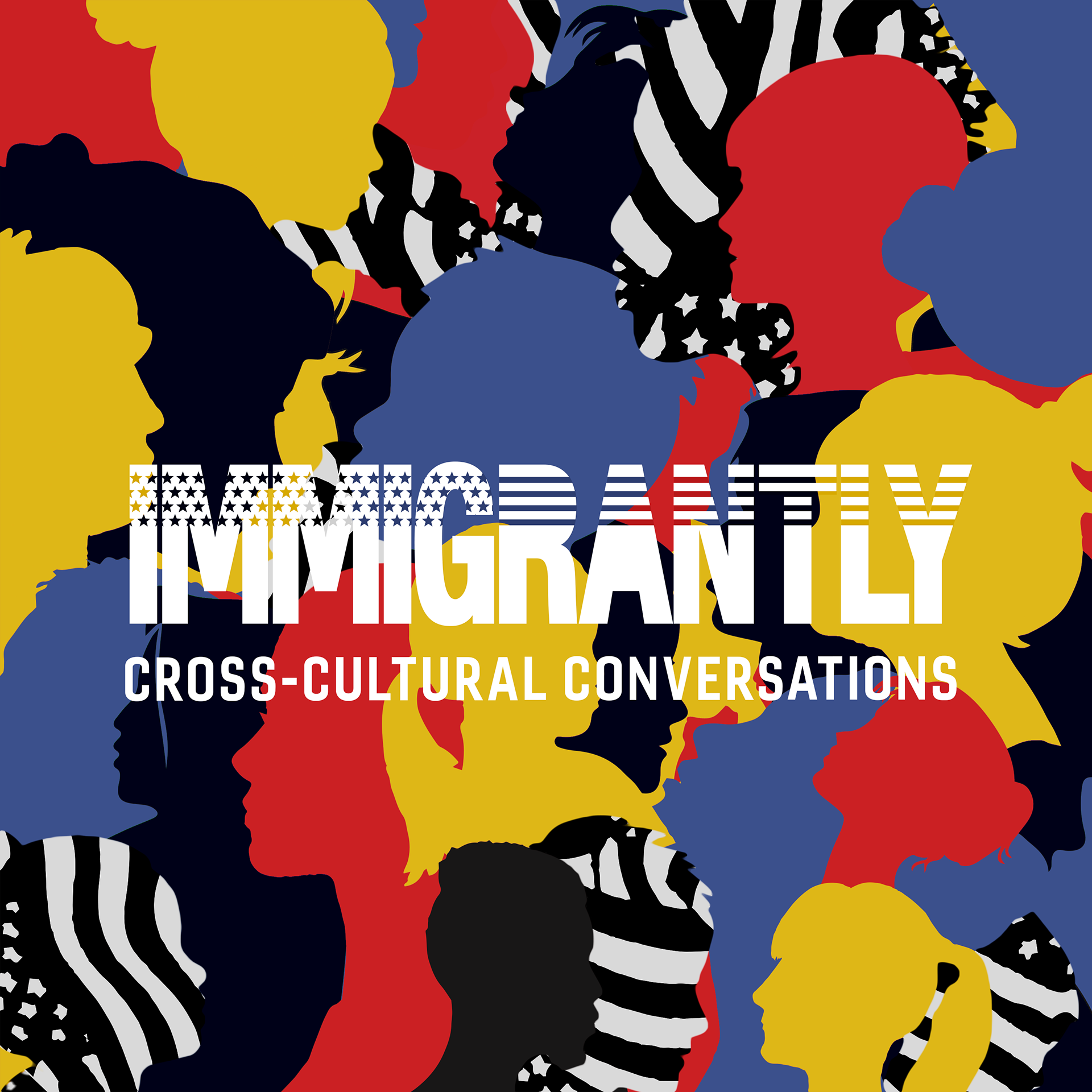
Podcast Cover Art Design
I was hired as a graphic designer by Immigrantly Podcast to design a cover artwork for their new podcast.
Initially, the podcast was unnamed, with only the following blurb provided:
Streamly fun, conversation-style podcast that dissects contemporary films and TV shows to explore the many exciting, thought-provoking….and sometimes problematic elements of pop culture that many of us binge on a daily basis. Cohosted by two Gen Z-ers from diverse backgrounds, this podcast is not just reviewing your next movie or TV show recommendation—we're diving into them, discussing their nuances, and grappling with the trends of present-day media—all through a comedic lens.
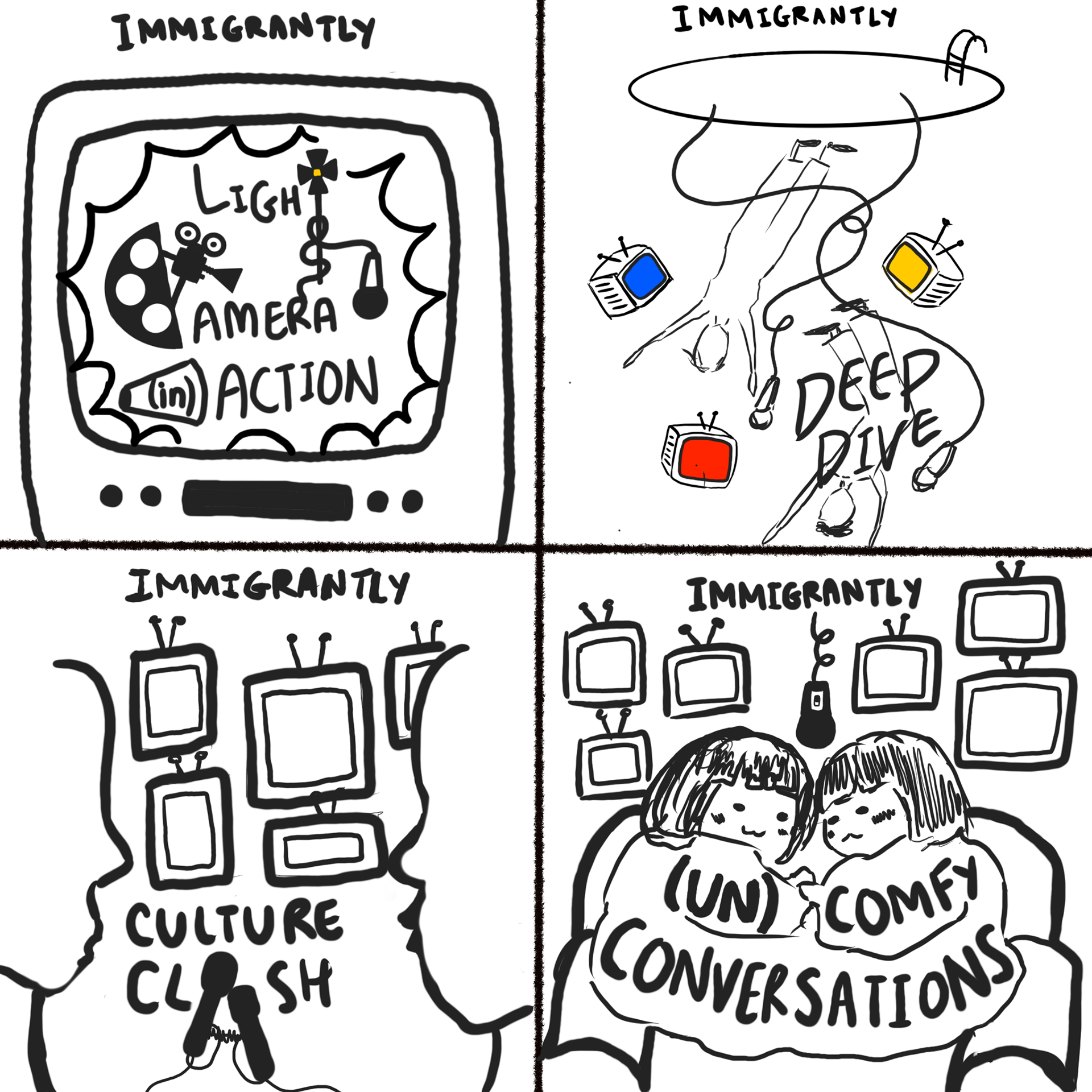
Title Suggestions for the Podcast at the time:
✦ Lights, Camera, (in)Action
✦ Culture Clash
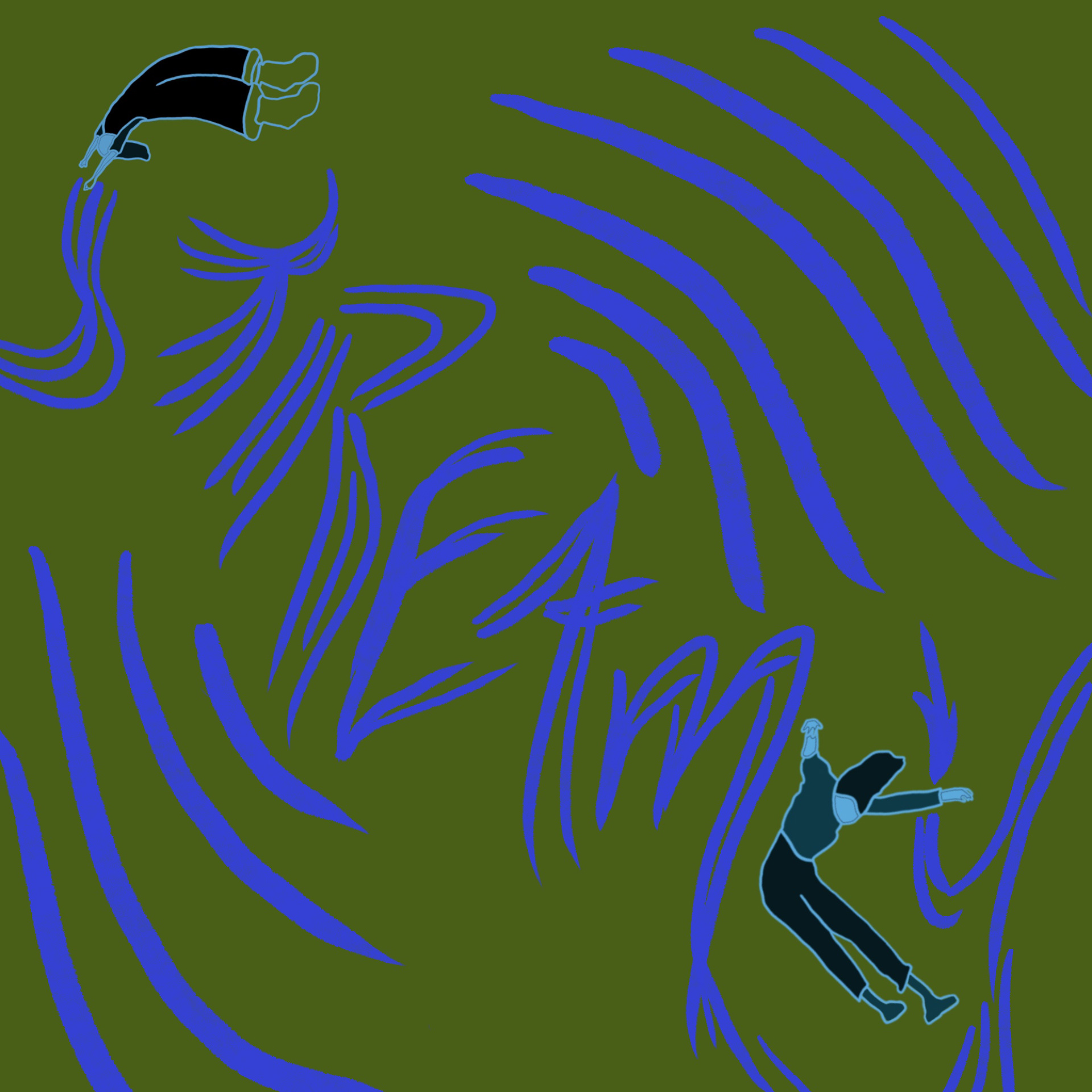
✦ Deep Dive
✦ (un)Comfy Conversations
1 \\ Initial Sketches and Brainstorming
Clients' Feedback:
The clients liked all the designs in the brainstorming phase, especially the "Deep Dive" design. Their only feedback was to make sure the Podcast title is the most prominent element on the canvas for easier brand and name recognition.
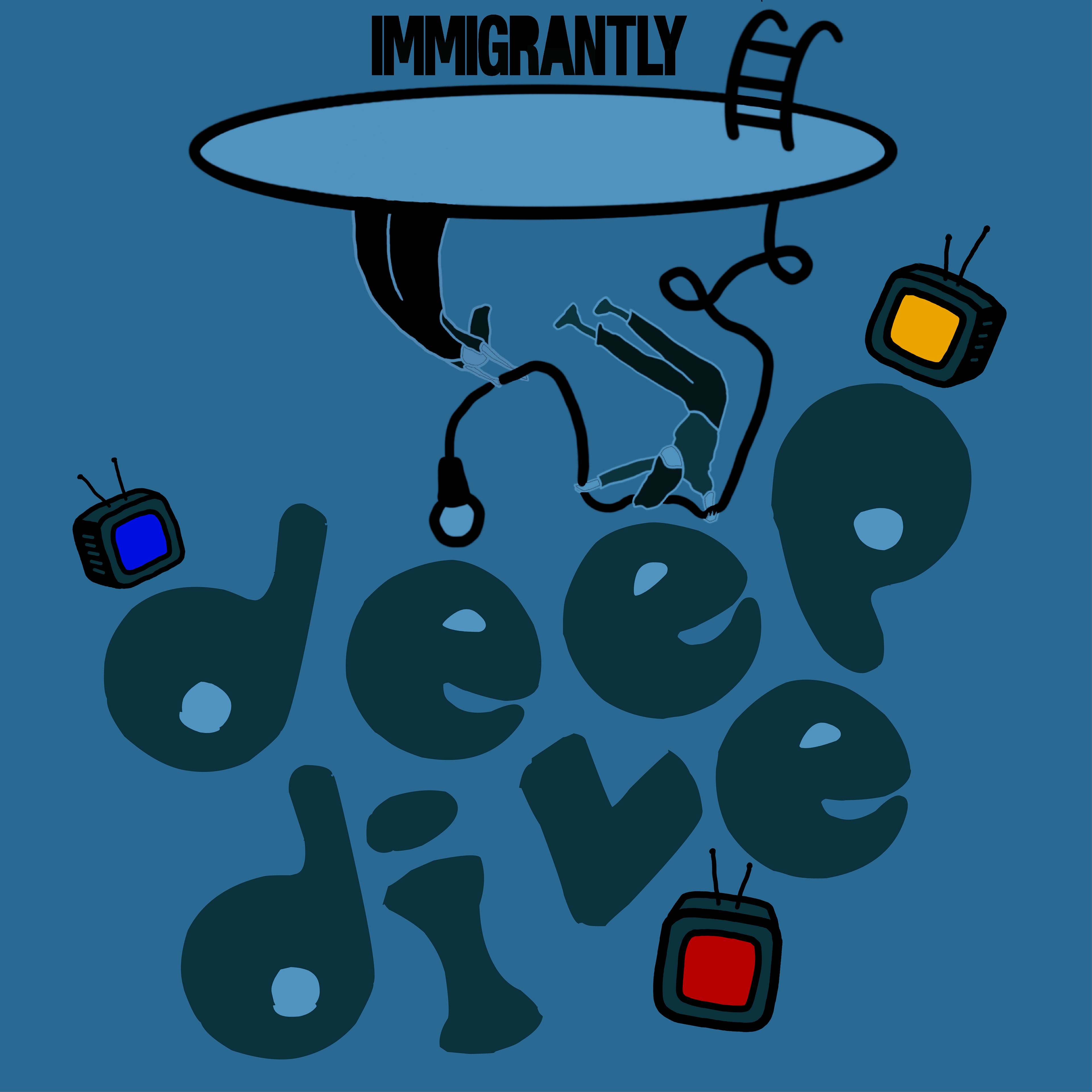
2 \\ Initial Drafts
With the feedback I received on my initial sketches, I chose to expand on the "Deep Dive" sketch to build some initial drafts.

Clients' Feedback:
They really liked the cover art concept, however, they were not sold on the name, "Deep Dive." This led to me putting this project on pause until another name was finalized.
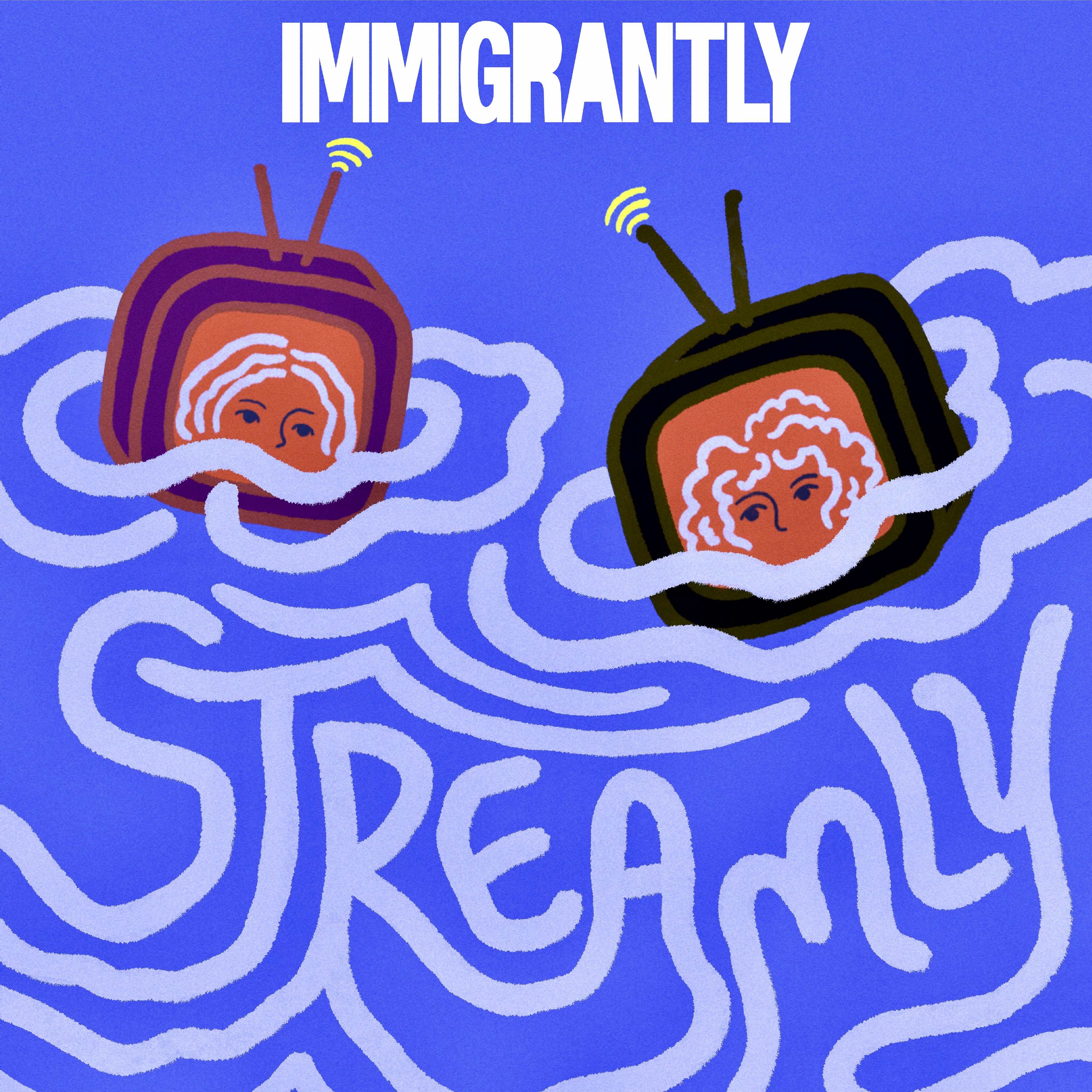
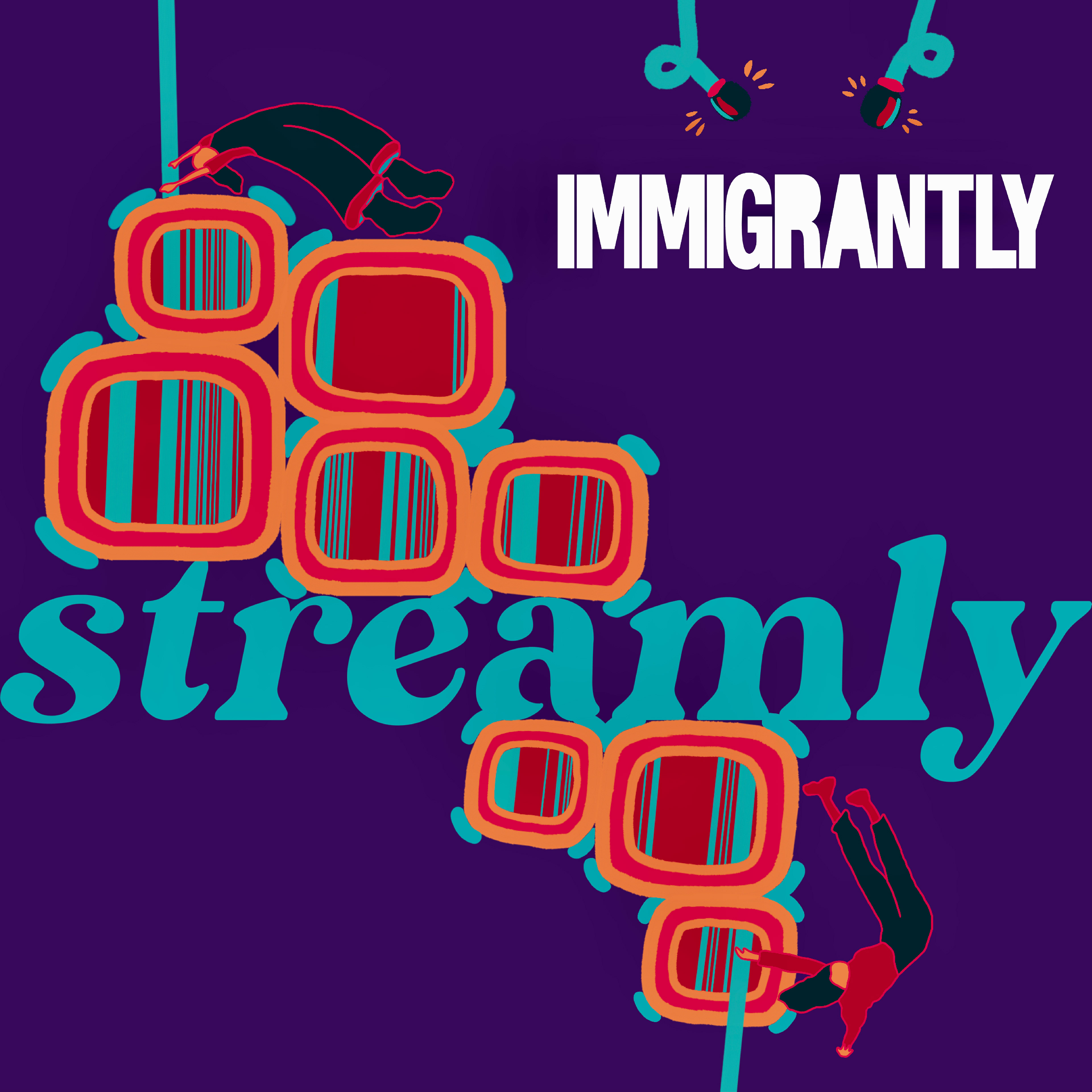
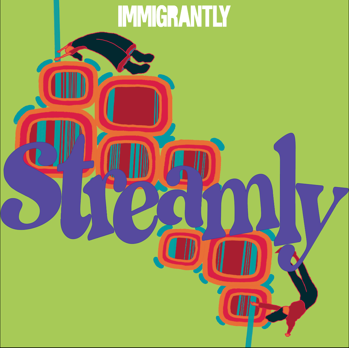
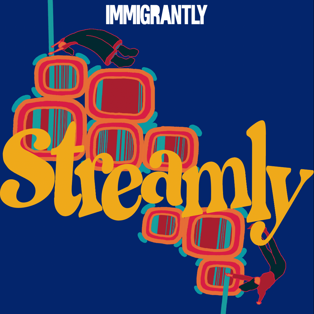
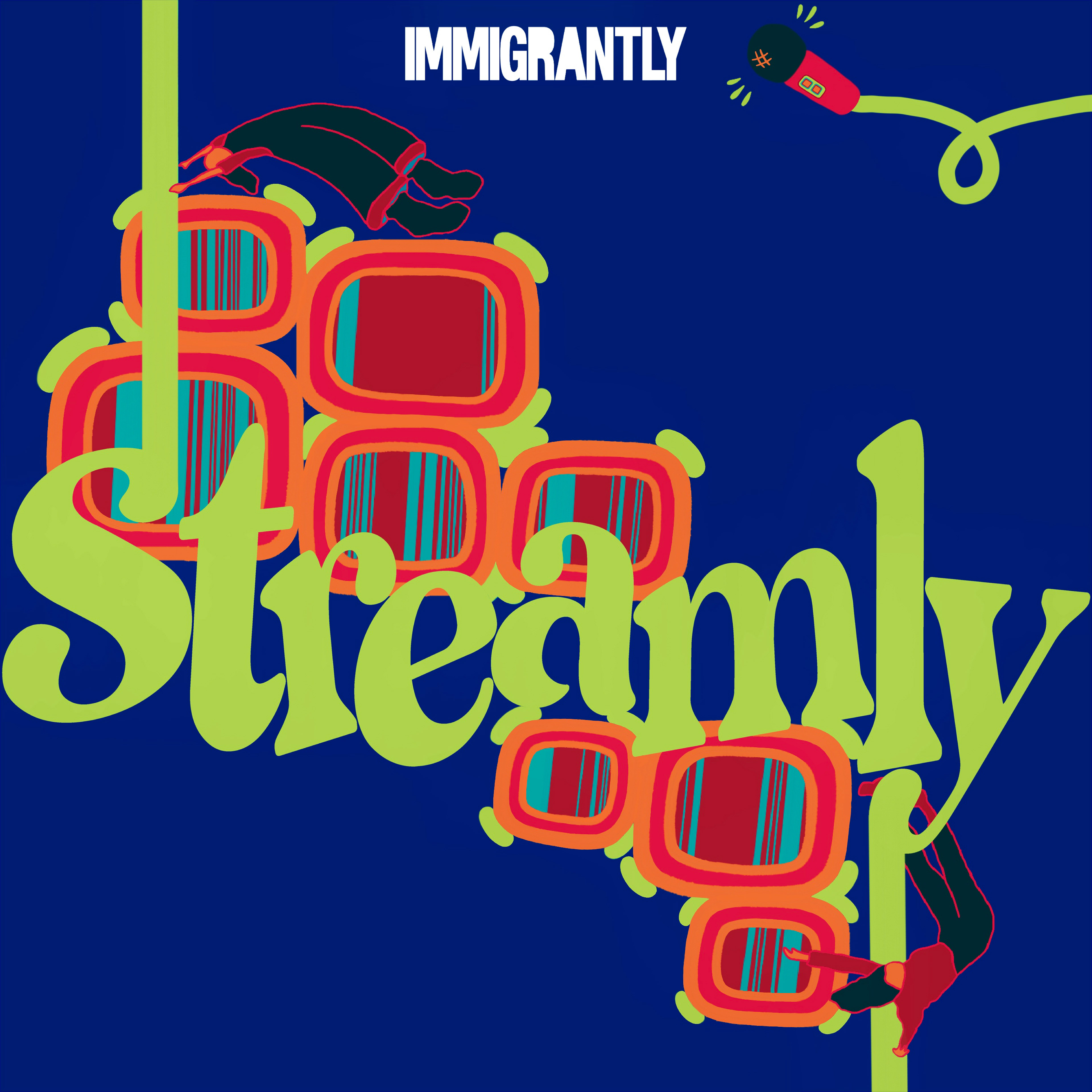
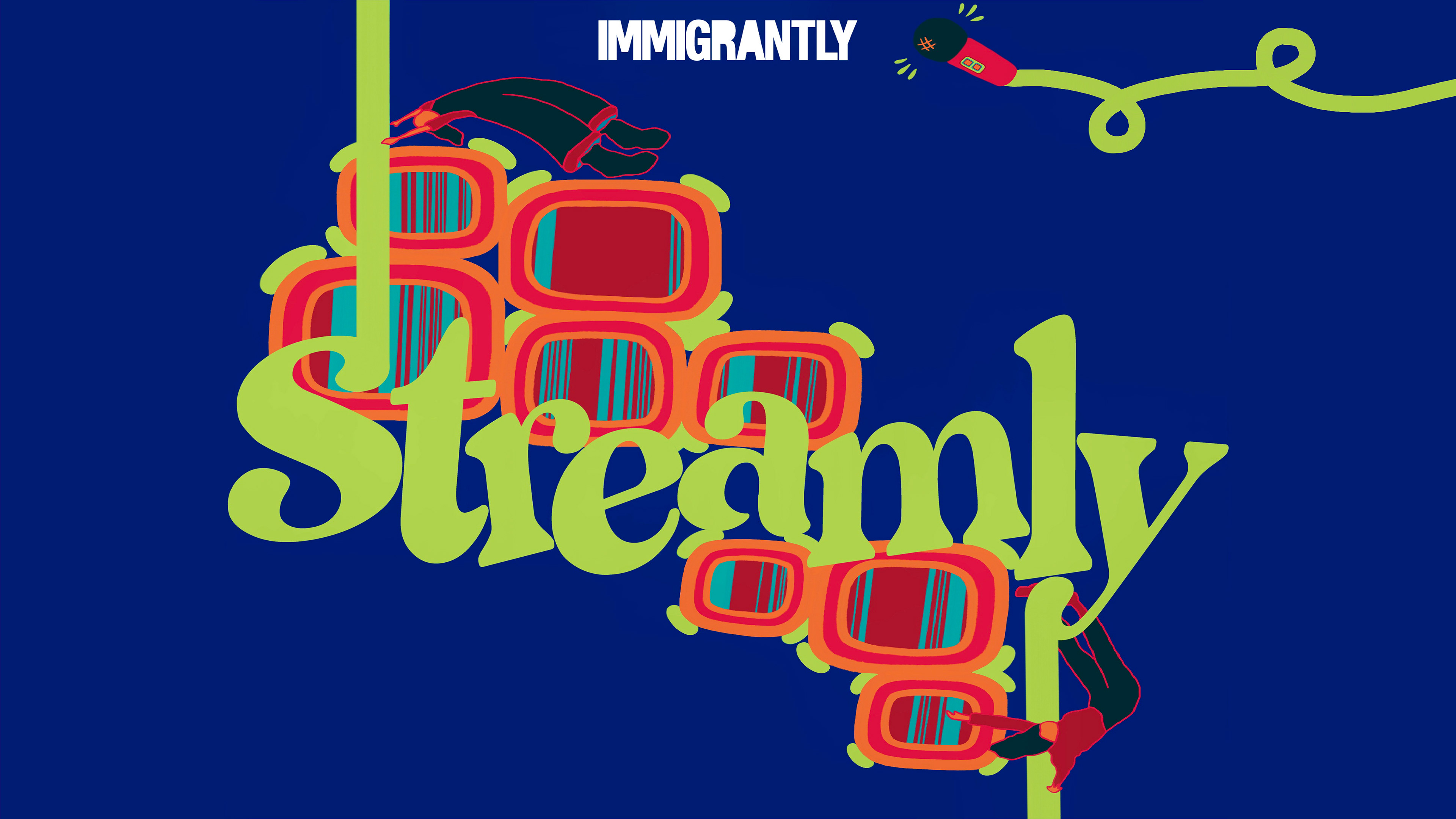
3 \\ Finalized Name: Streamly
Clients reached back out to me a month ago with the finalized name of "Streamly."
From there, I began brainstorming again and creating initial sketches.
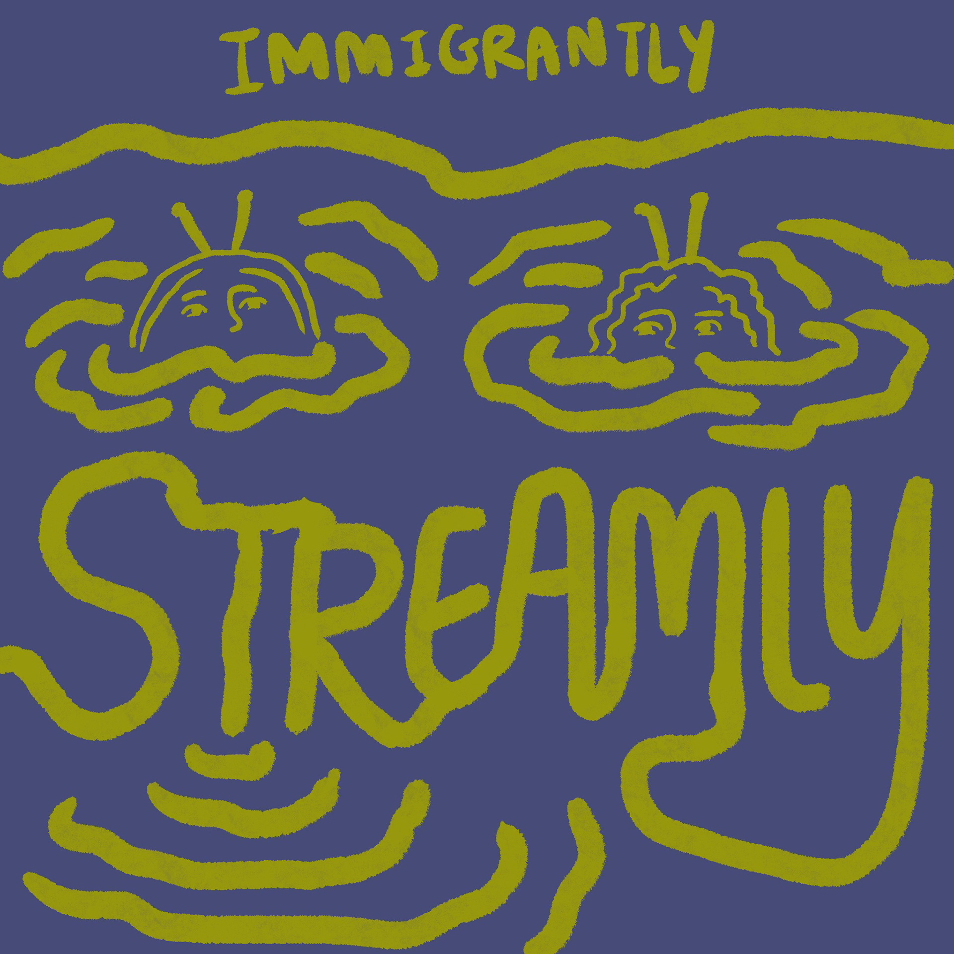

From the sketches, I decided to expand on the first two ideas and created initial drafts of the designs.

Clients' Feedback:
The clients preferred the purple design over the blue design. They noted that the Immigrantly font should be much smaller and in the top center, and "Streamly" should be more apparent and bigger. They liked the headphones idea in the second purple. They didn't really like the purple color, and asked me to play with the color a bit.
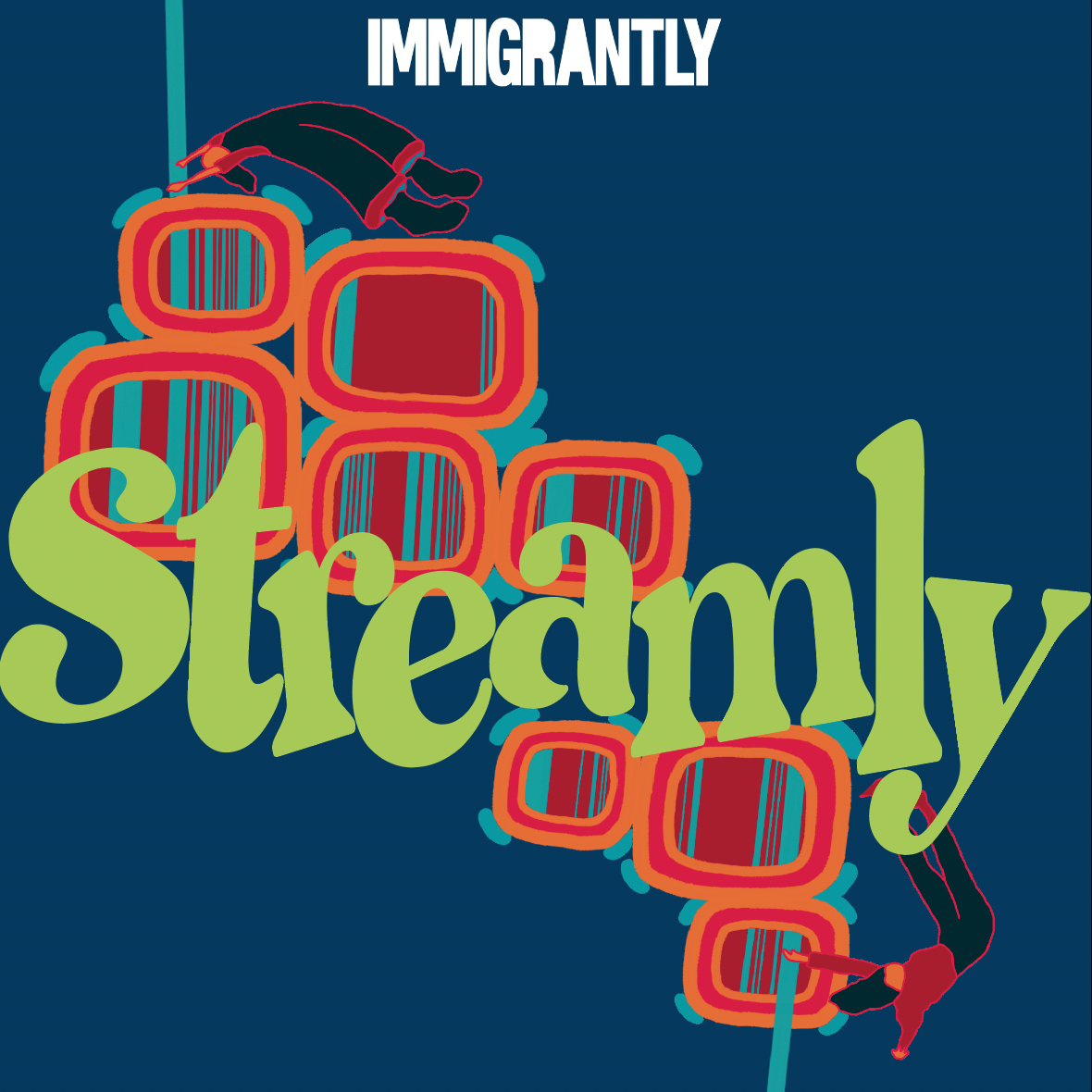
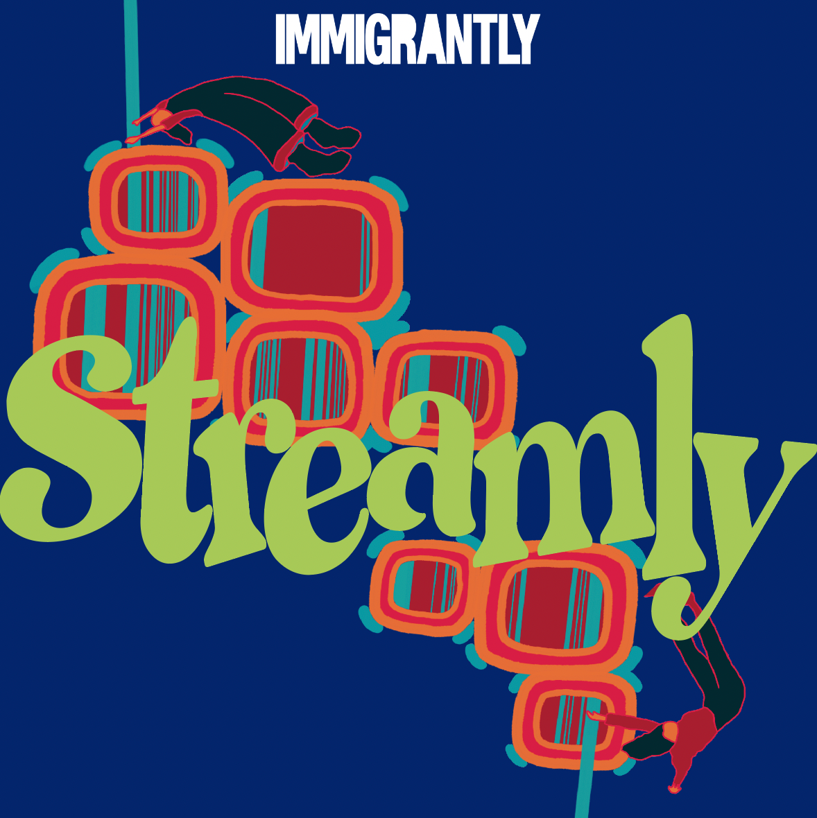
4 \\ Finalized Design Concept
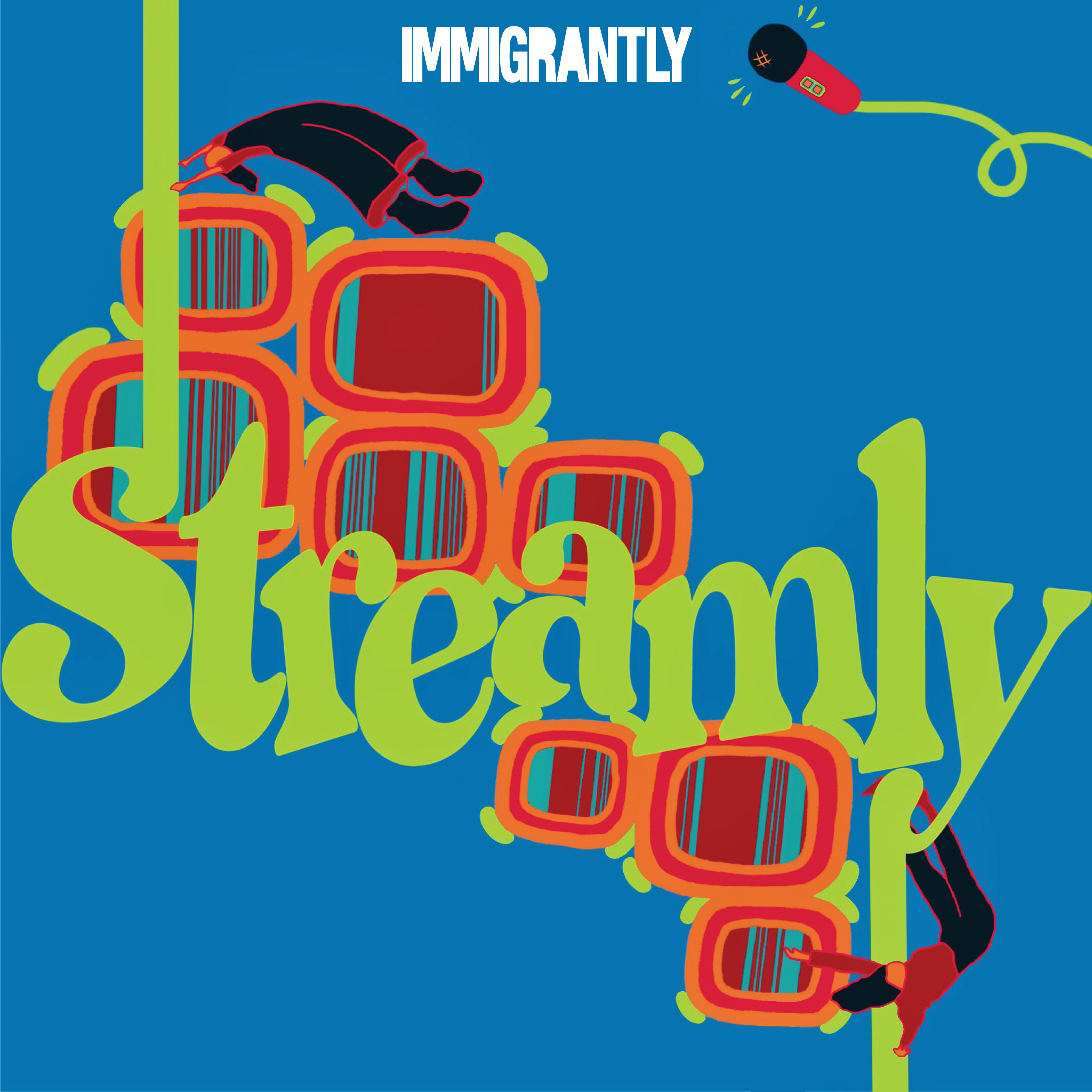
Clients' Feedback:
The clients really liked this design. The only thing they were concerned about is the visibility of "Streamly."
In turn, they asked me to play with the color palette more, and suggested I use palettes generated from a trending palette generator.
5 \\ Color Variations
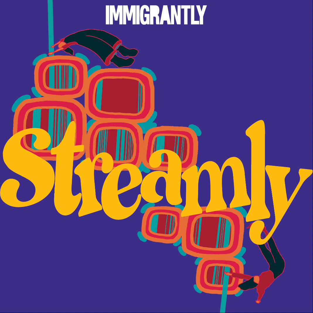
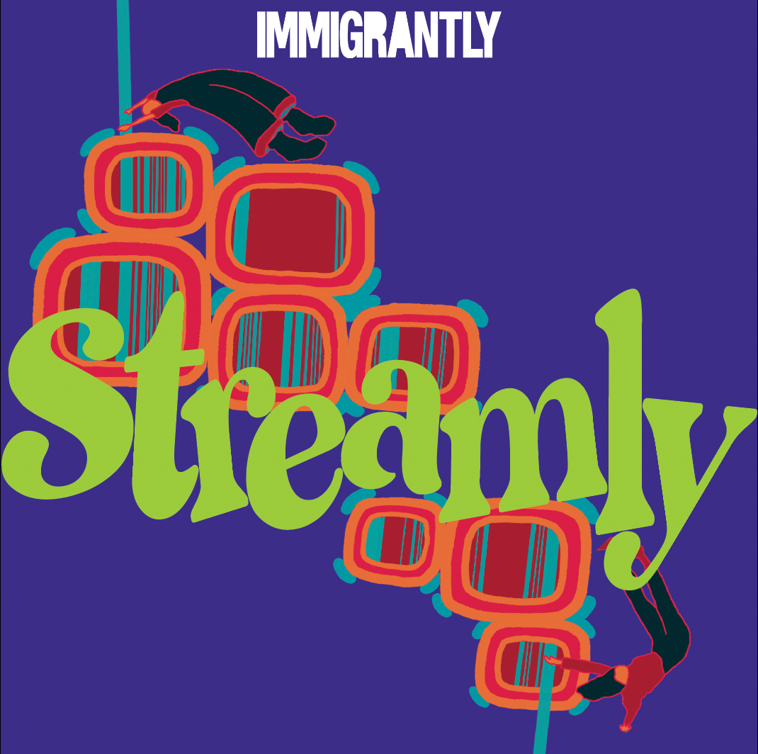

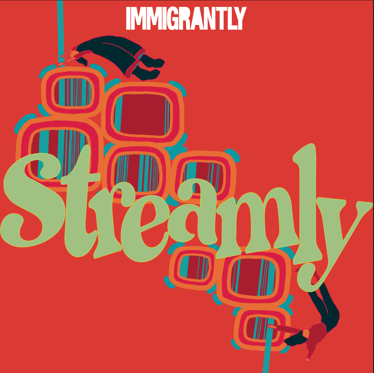
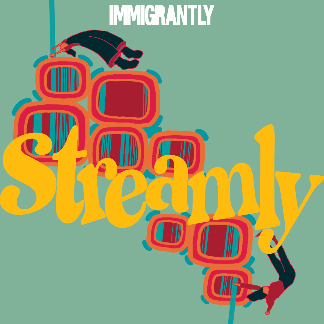
I generated a series of edits from different color palettes generated from the website generator.
Clients' Feedback:
The clients loved the different color variations. The narrowed down the designs to their favorite ones and then also considered which color design would be the most visually accessible (as one of the clients was colorblind).
The clients chose the dark blue-green design as their favorite.
6 \\ Deliverables


A month after giving the clients the final designs, they emailed to notify me that they ran into some trademarking issues with the name, "Streamly."
They shortly changed their podcast name to "Banterly," which required me to update the designs with the new name. They also decided to go with the green-yellow color variation that I had previously provided to them as the color scheme for the podcast.
7 \\ Final "Banterly" Designs
Deliverables Requested:
✦ Exports of the final designs in four sizes (1600x1600, 3000x3000, 1920x1080, 2560x1440)
✦ Square and Rectangular Banner including only the design (without the name)
✦ Hex codes
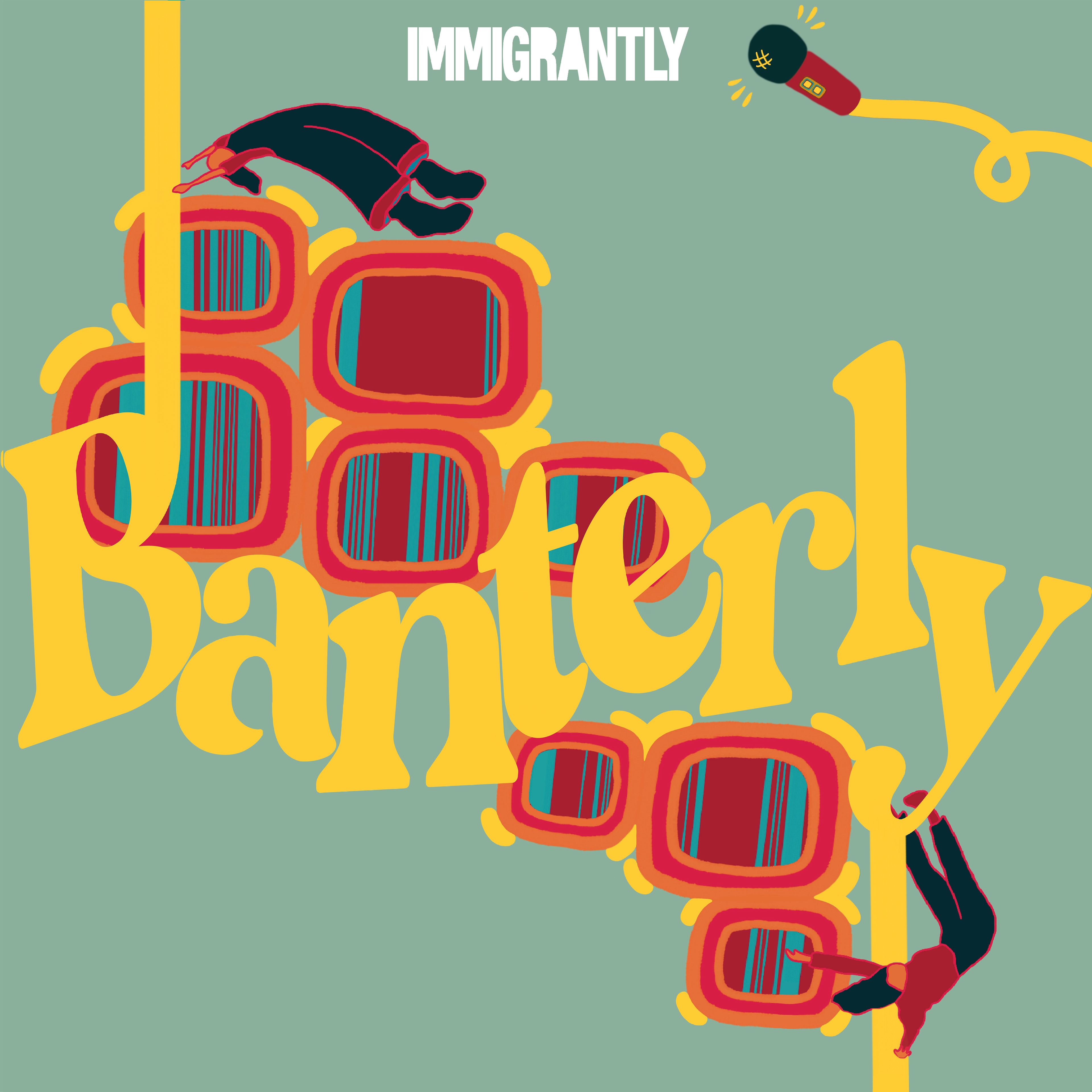

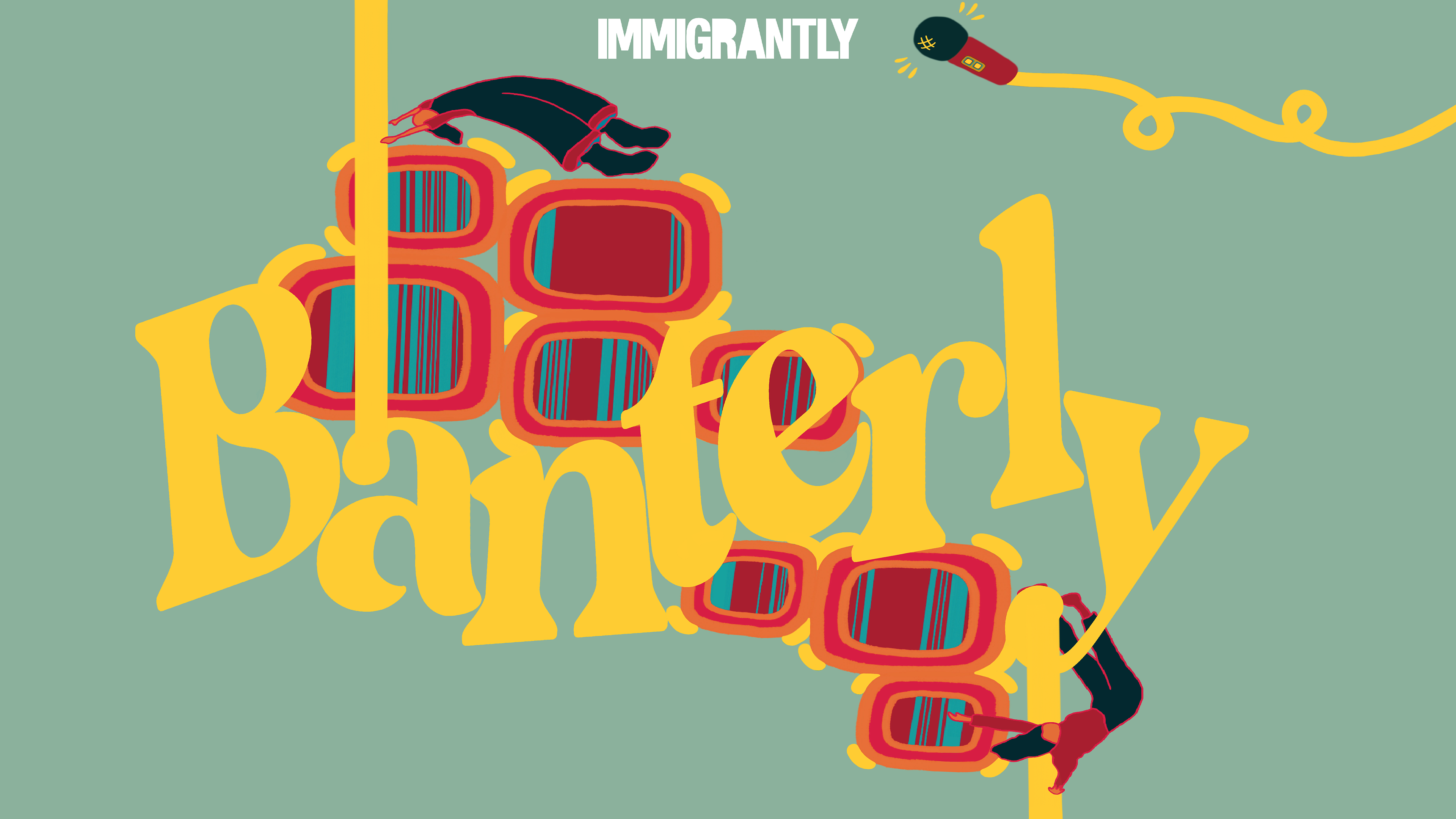

Hex Codes.
✦ Muted Green: #8bb19c
✦ Yellow: #fecc33
✦ Hot Pink: #d71d43
✦ Red: #a81e2f
✦ Orange: #e86f38
✦ Teal: #169e9c
✦ Navy Blue: #03282f
✦ White: #ffffff
Immigrantly Media Icon Design
Immigrantly was expanding into a media company and needed an icon to use on their Apple Podcast, website, social media channels, etc.
They wanted for the icon to represent some aspect of the immigrant identity and suggested to play towards a suitcase motif.
1 \\ Initial Sketches

Lemonada Media's lemon icon was brought up as inspiration for Immigrantly's icon.
Considering the dainty-ness of Lemonada Media's lemon icon and pursuing the open suitcase idea, I tried to play with these aspects and combine it with Immigrantly's cover art motif of assembling parts together to make a whole.

2 \\ Iterations; Concept #1
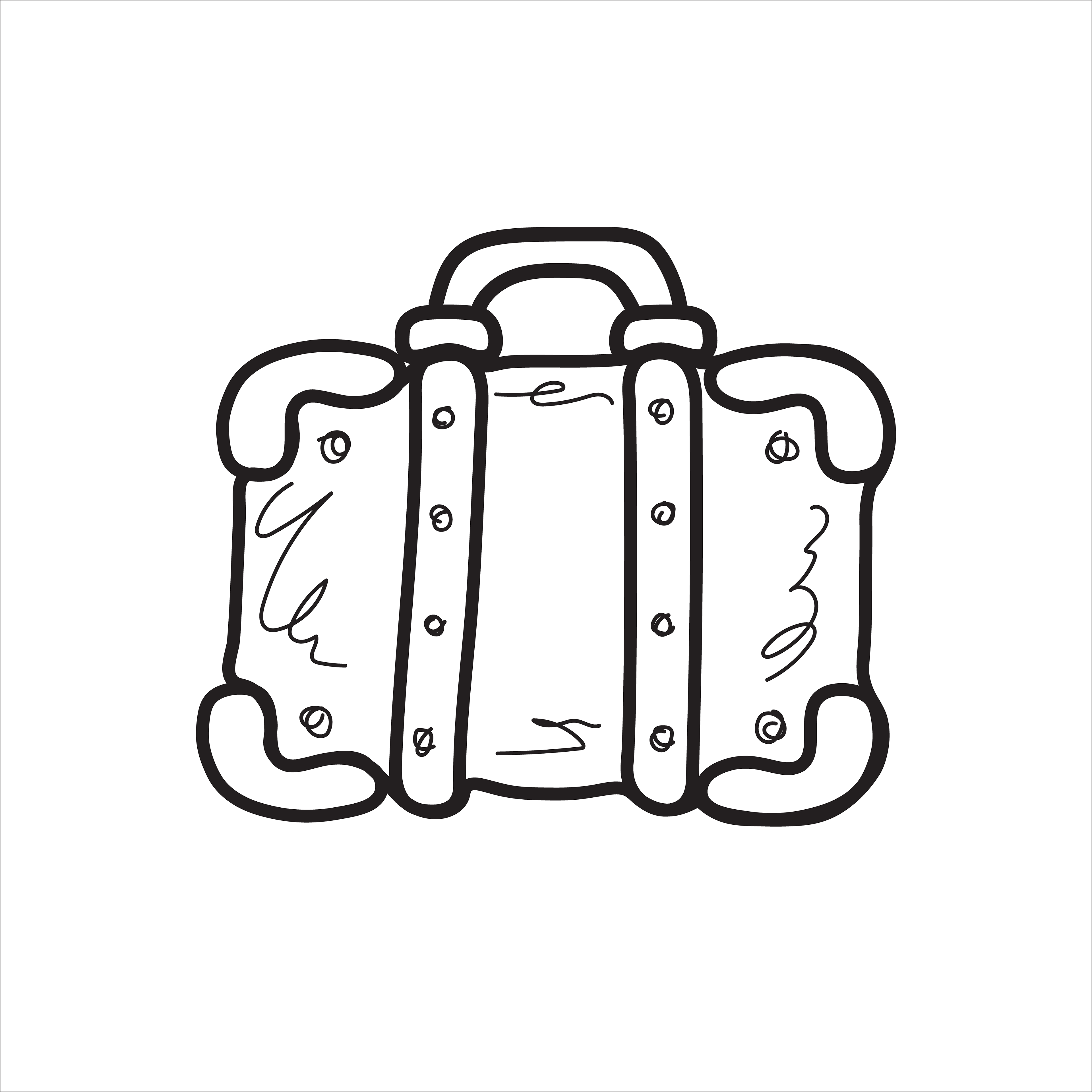
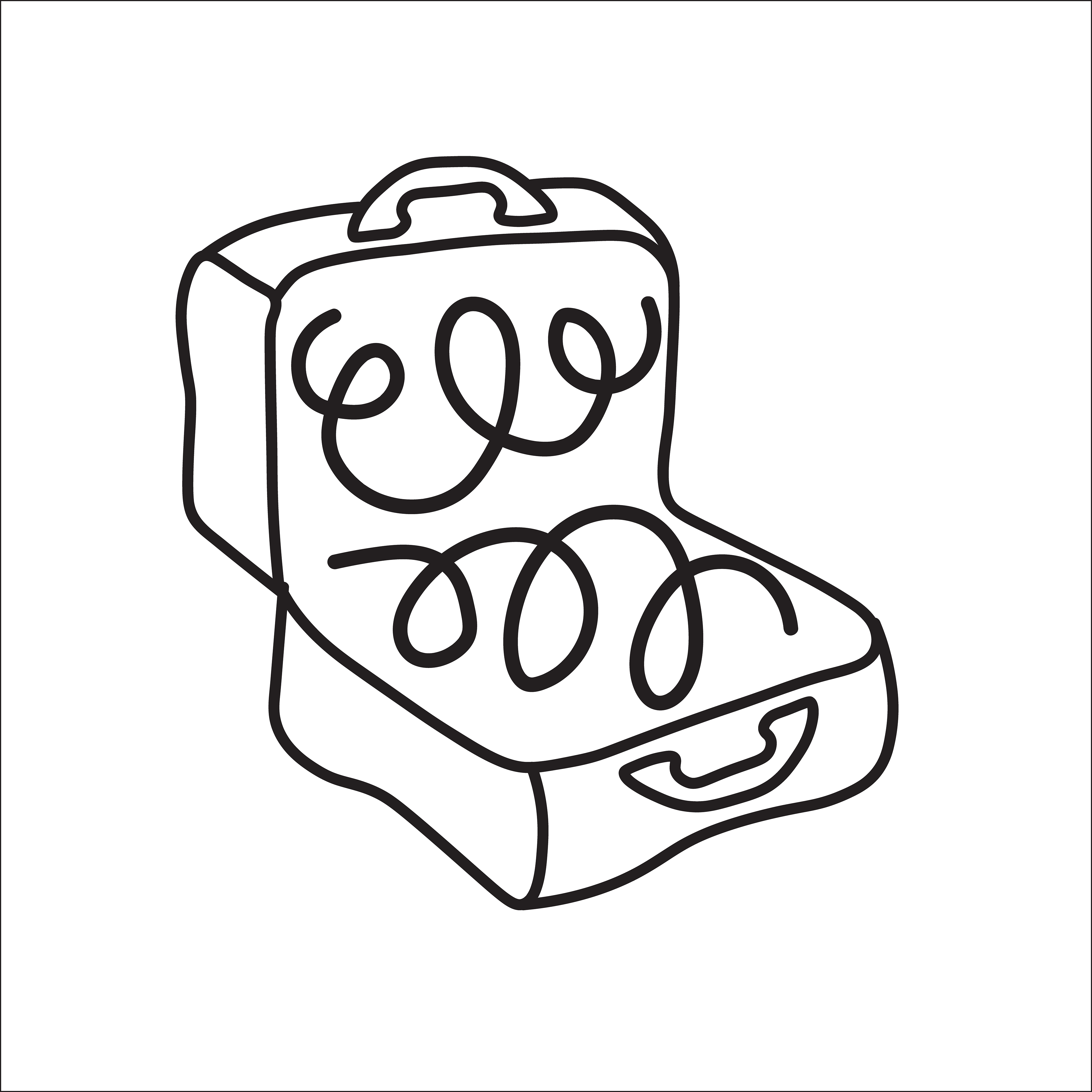
I thought about an open suitcase concept. The first iteration was an open suitcase with puzzle pieces of the world's continents arranged in a scattered formation to go with Immigrantly Podcast's cover art design.
The colors of red, blue, and yellow were taken directing from Immigrantly's cover art design.
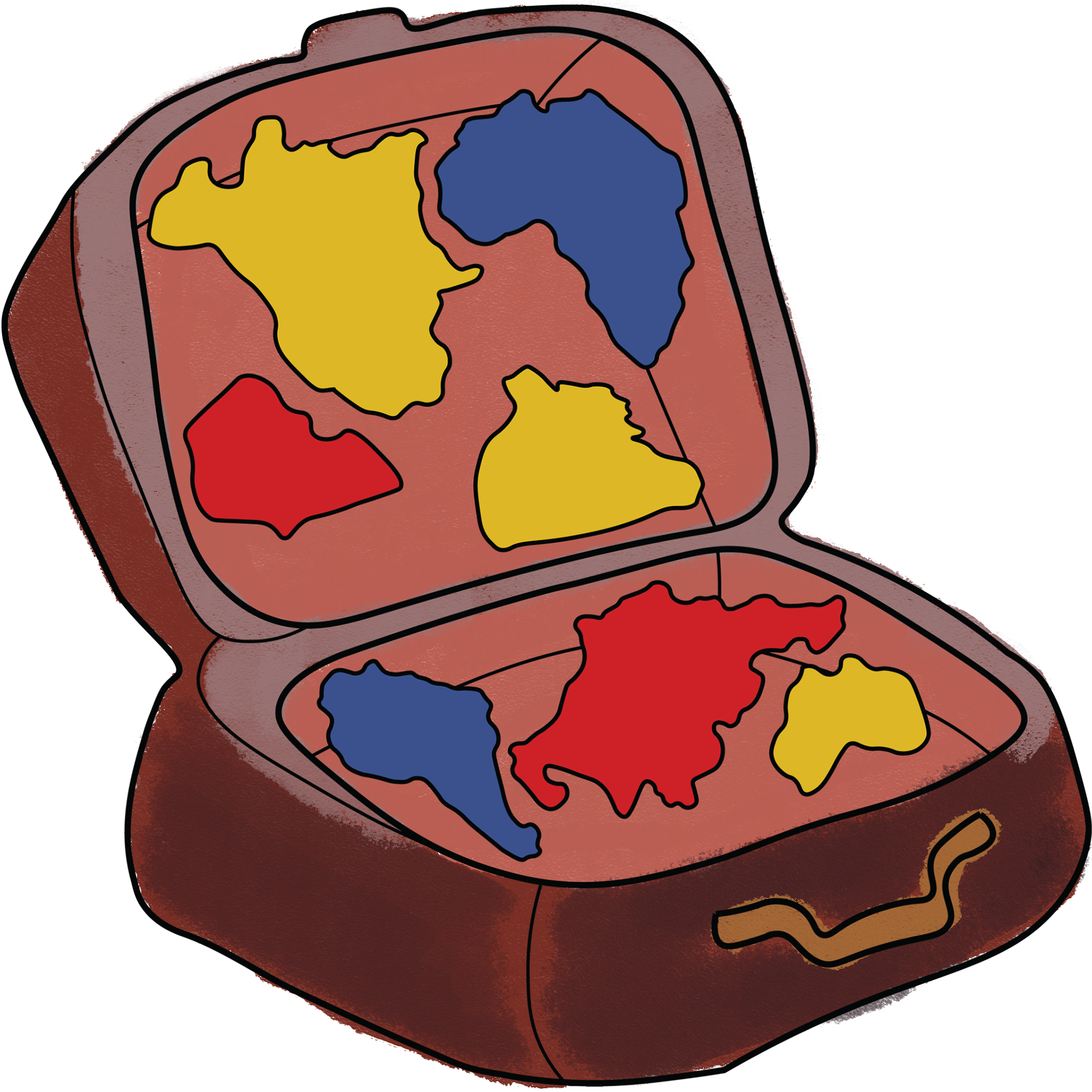
Feedback: This idea was not what Immigrantly was looking for. They envisioned an icon that also functioned as a logo to represent their media company's identity.
2-1 \\ Iterations; Concept #2
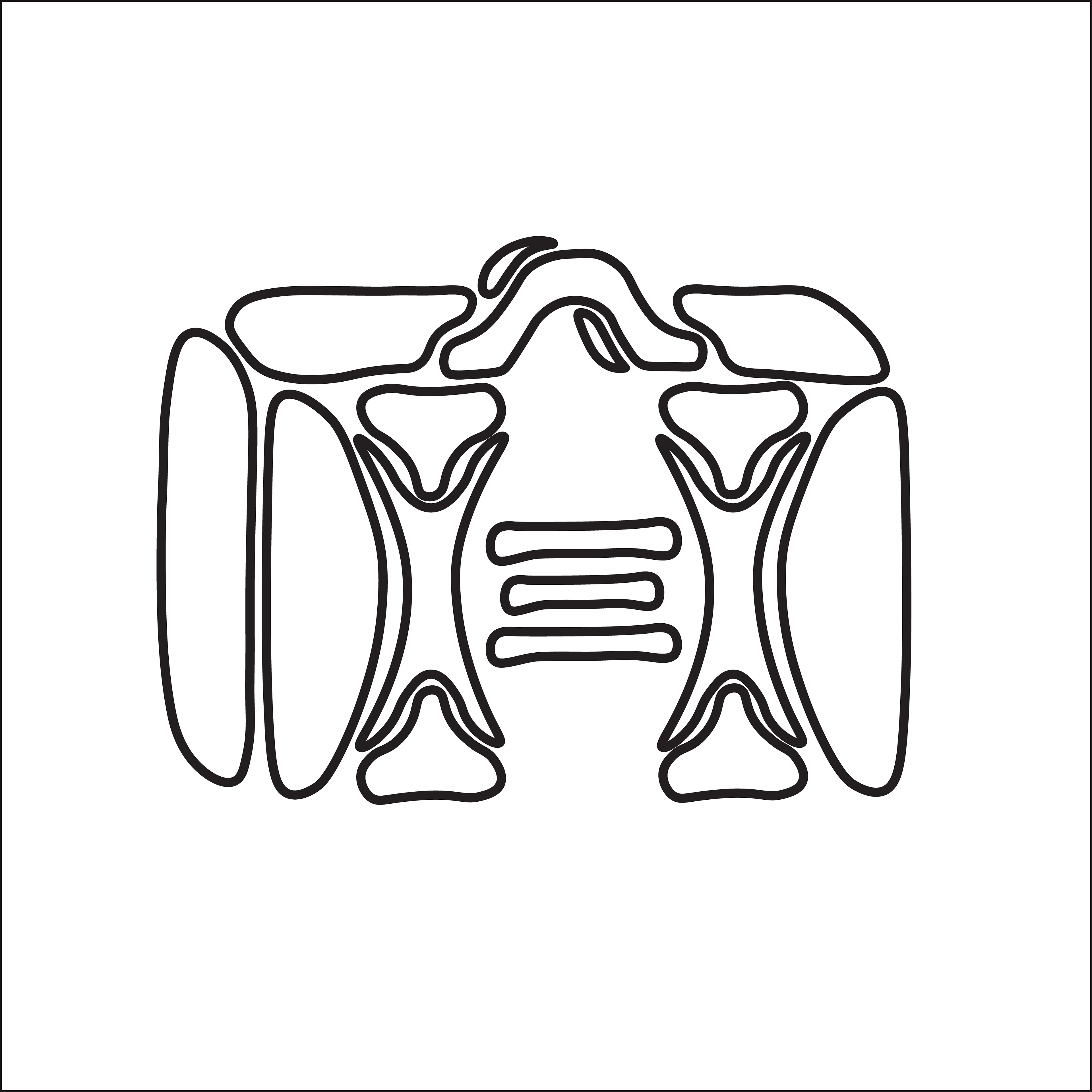
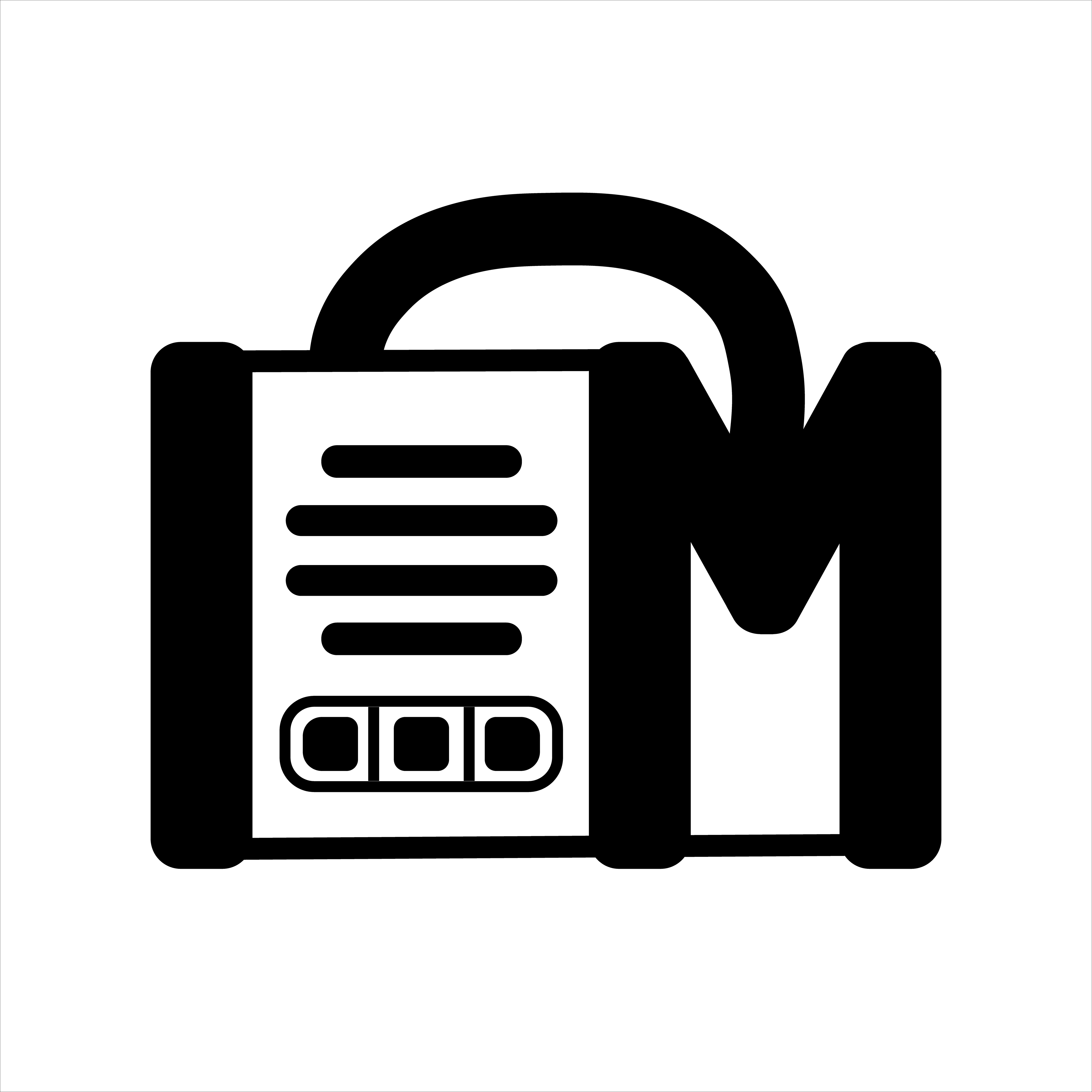
I pivoted to thinking about making an icon that was more logo-like, with thicker, more defined lines. I also played with ideas of a logo that looked like a suitcase, yet also may resemble a radio, record player, or boombox, alluding to the listening media-esque of Immigrantly's brand identity.

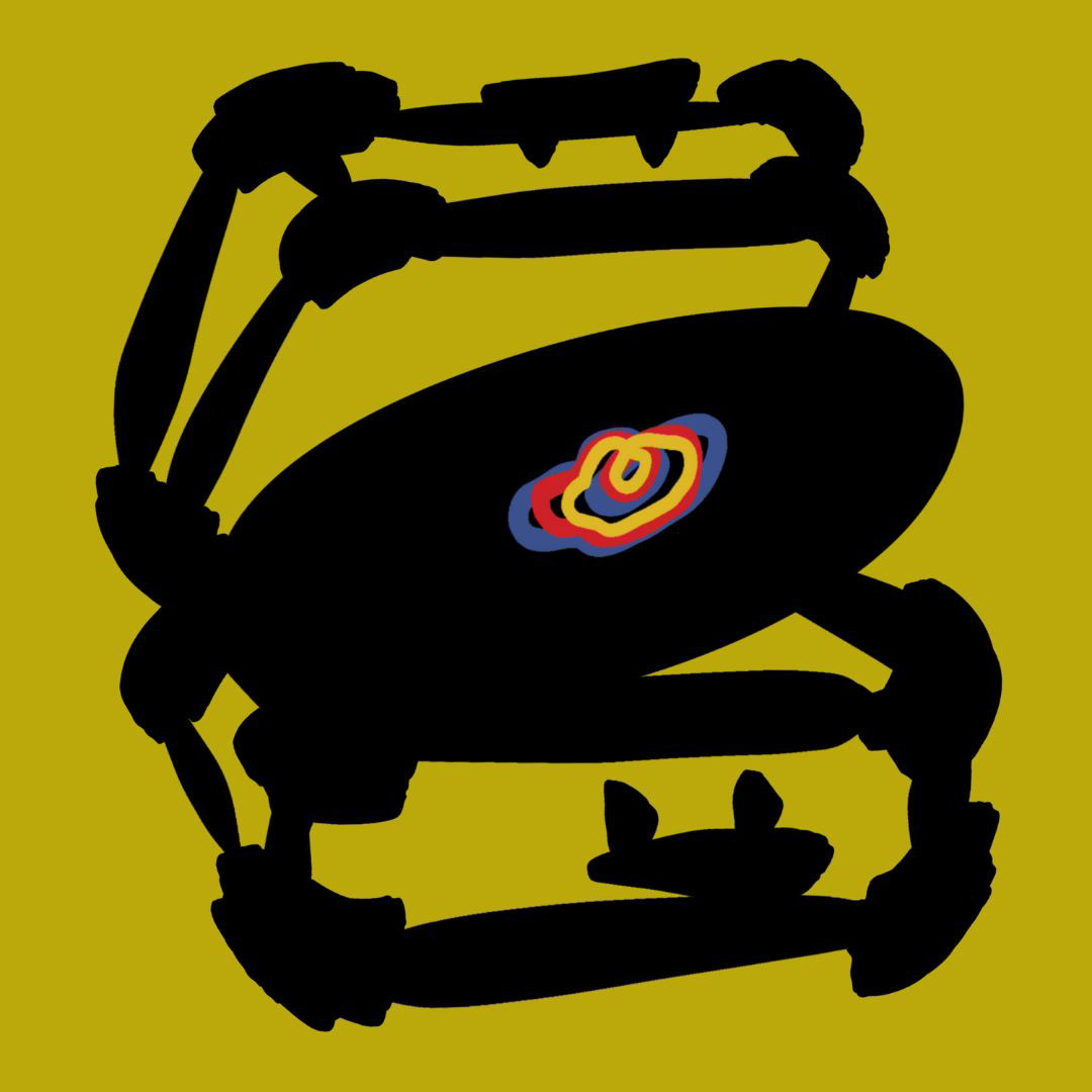
Feedback: The icon seemed too sci-fi. They envisioned a more rounded logo for a softer look.
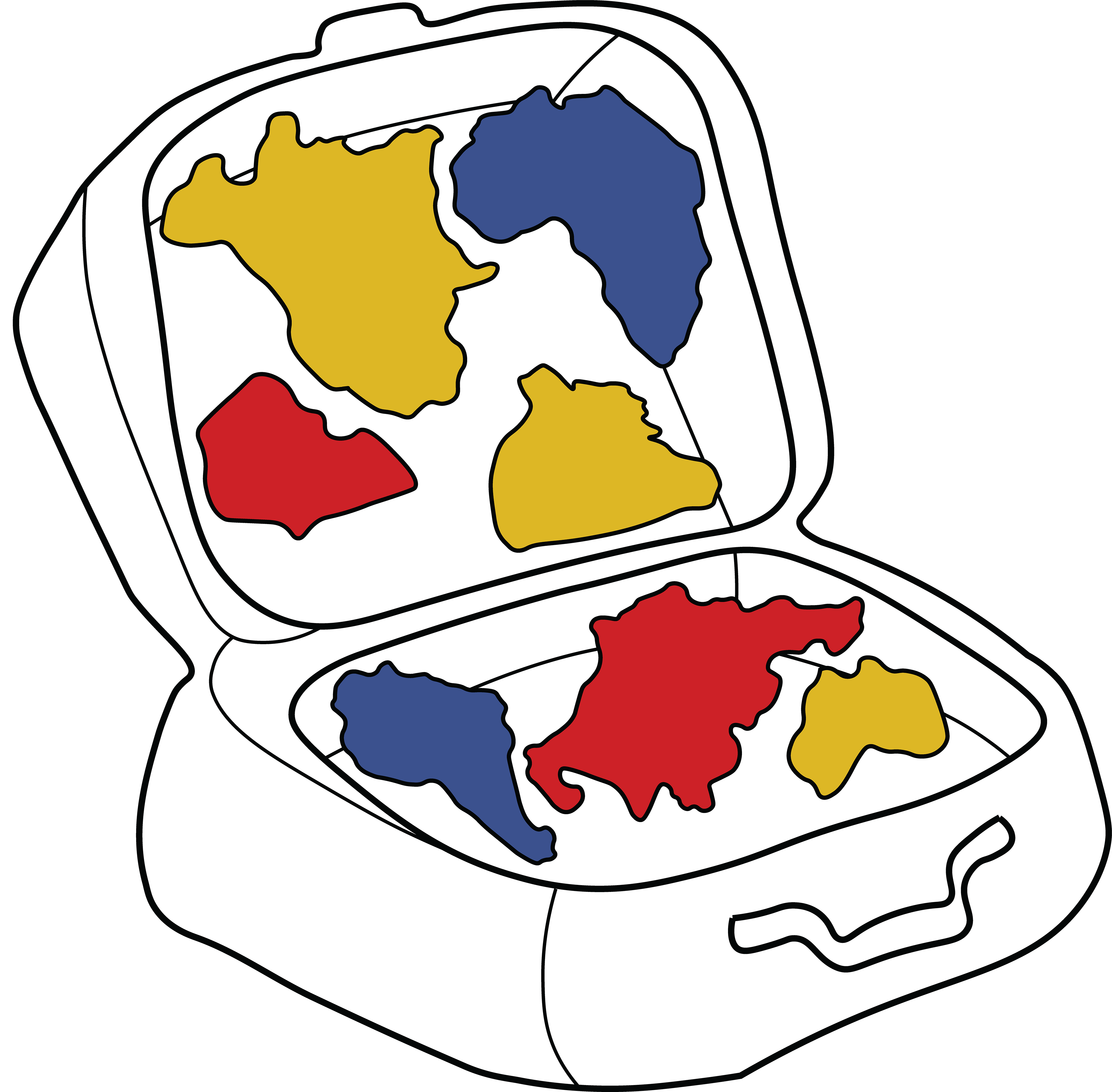
3 \\ Re-Sketching

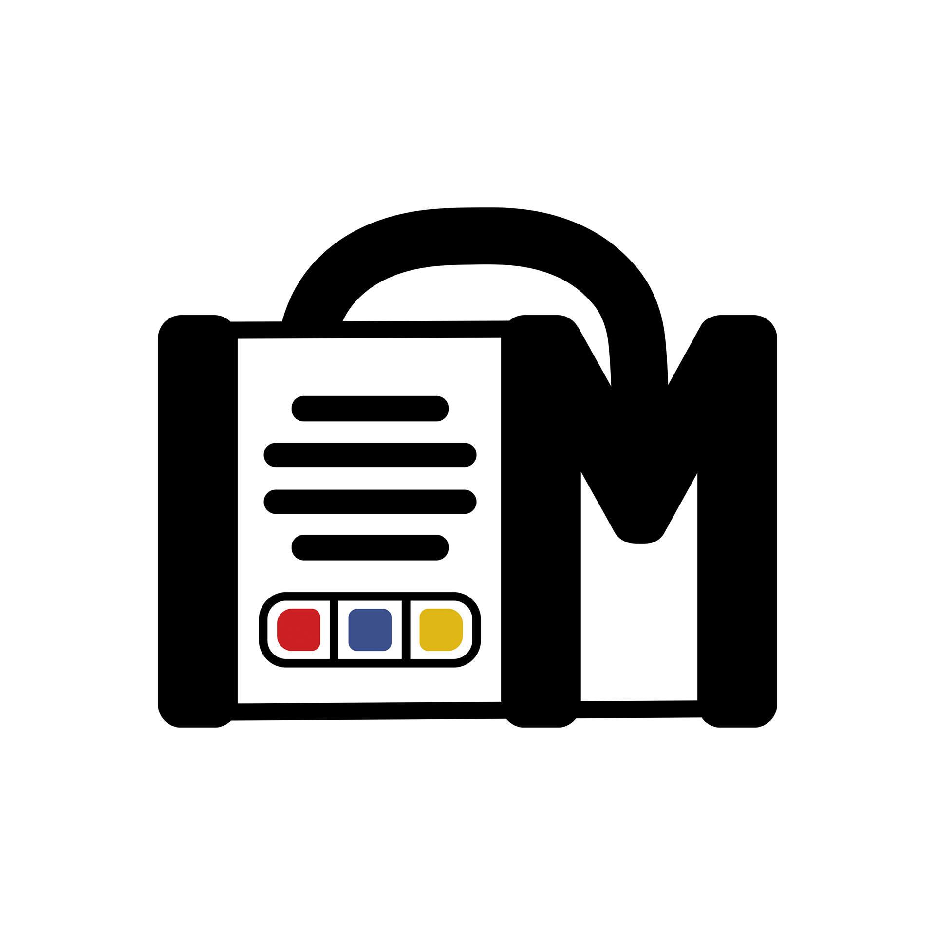
The team liked the first two sketch ideas; I then created icon designs based on the two sketches in Adobe Illustrator.
3\\ Icon Building
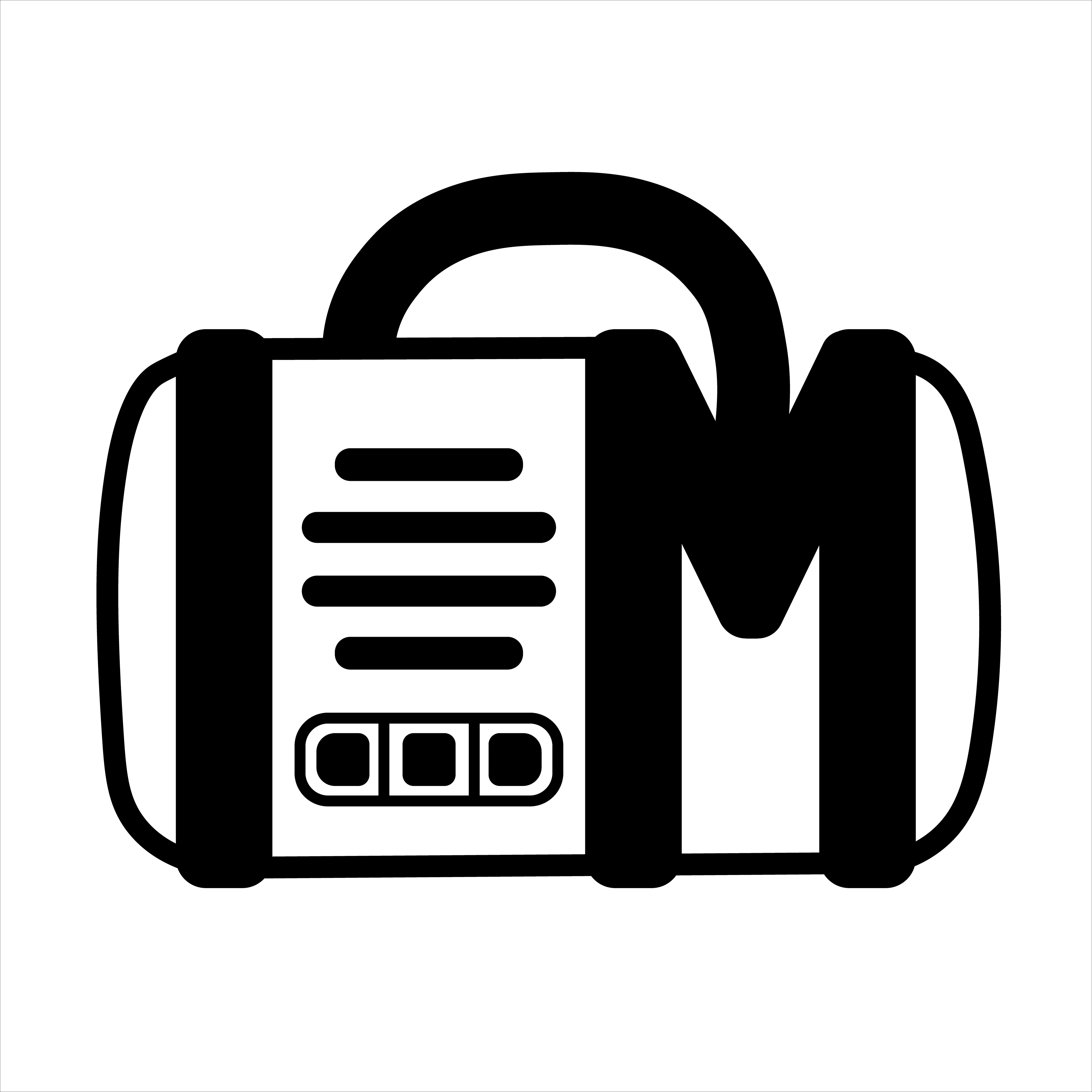
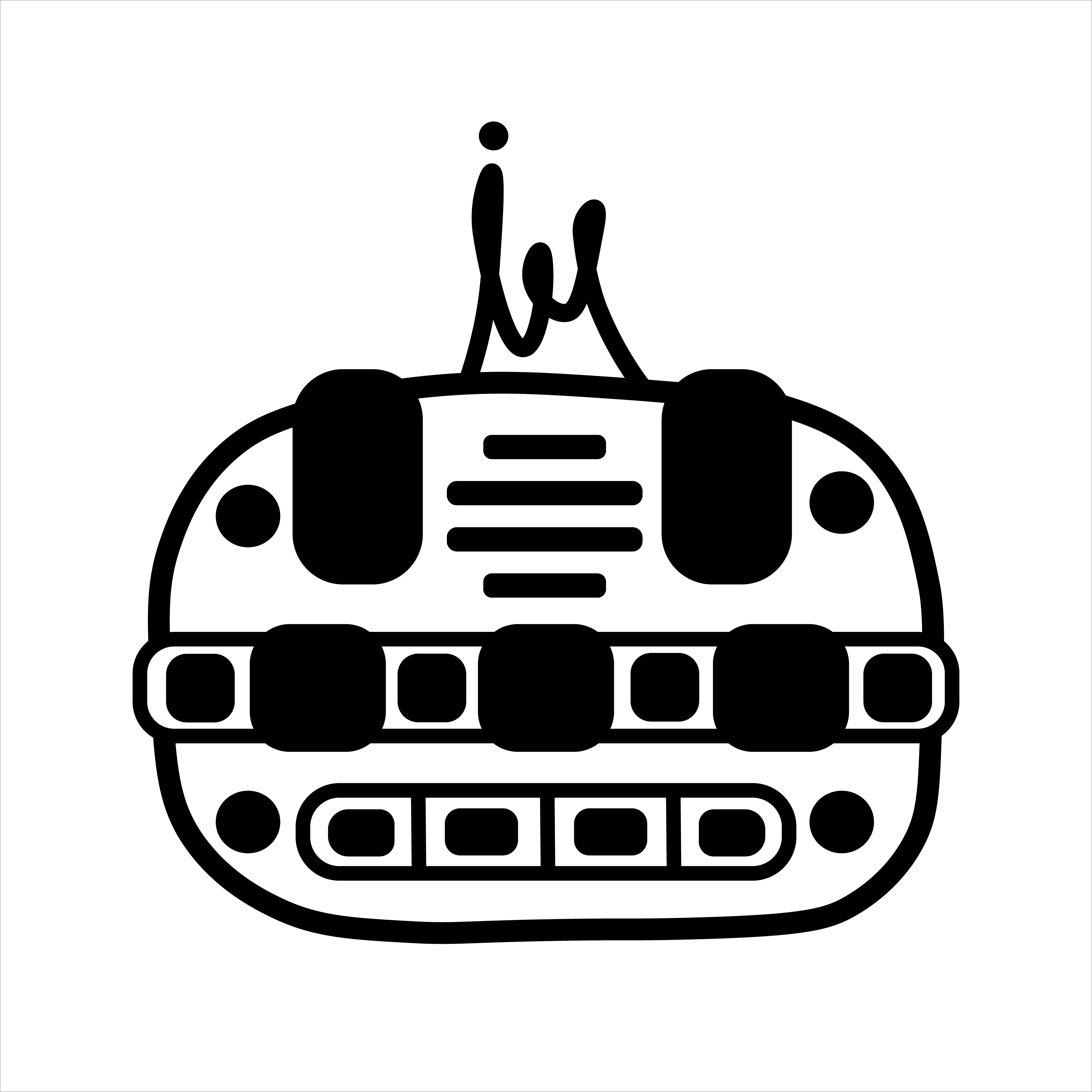
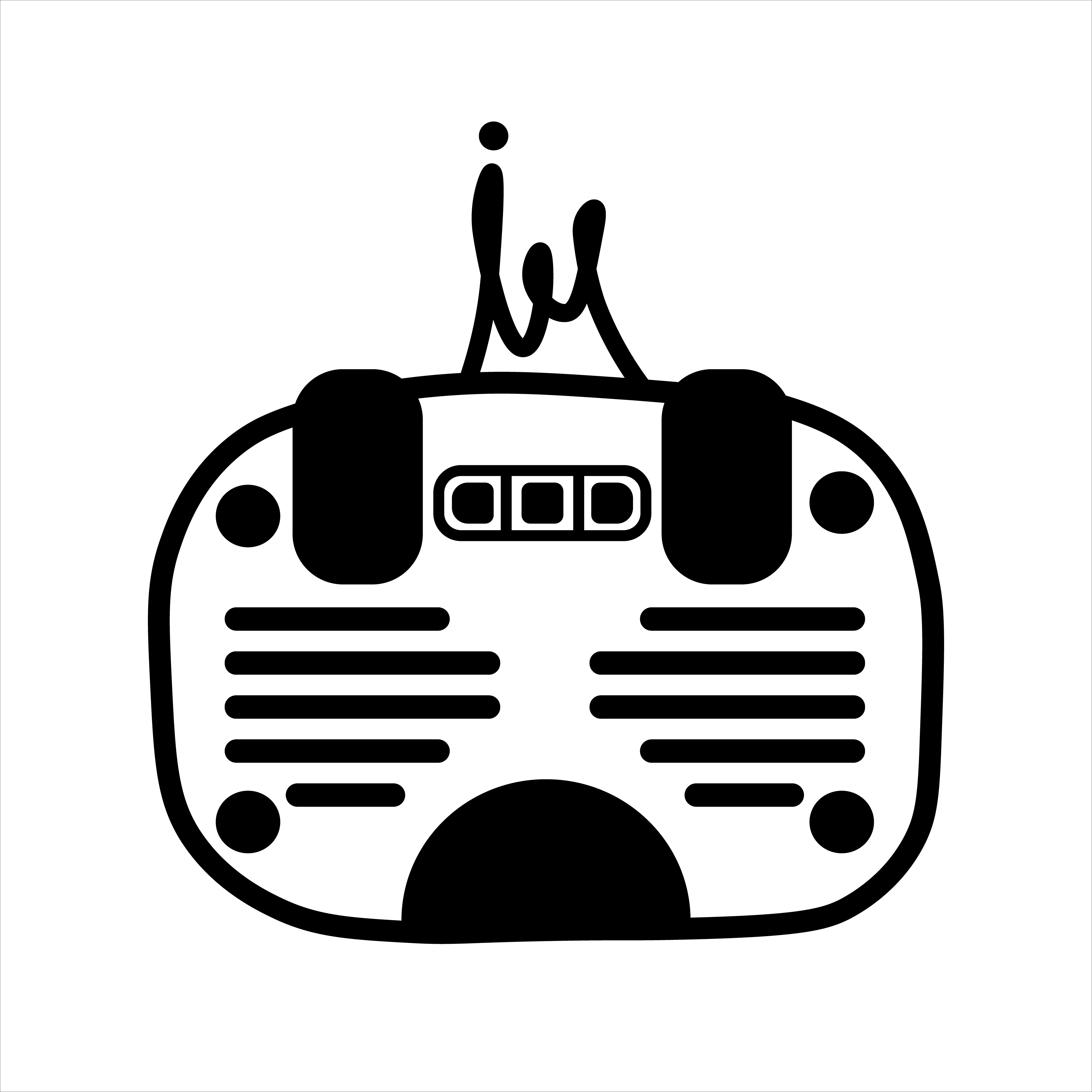
Feedback: The team liked icon design #2, but they wanted to see the icon in different color variations.
4 \\ Icon Color Variations
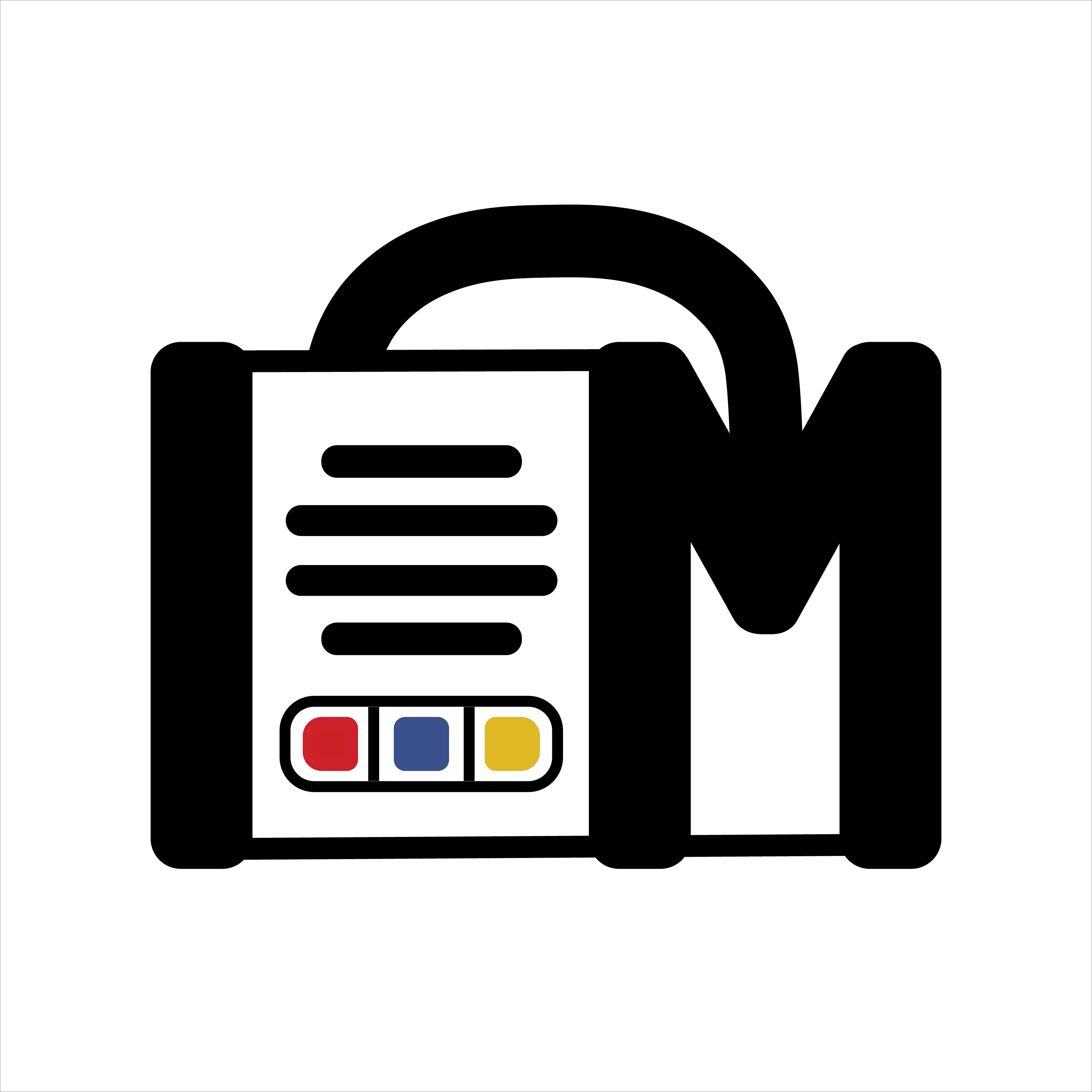
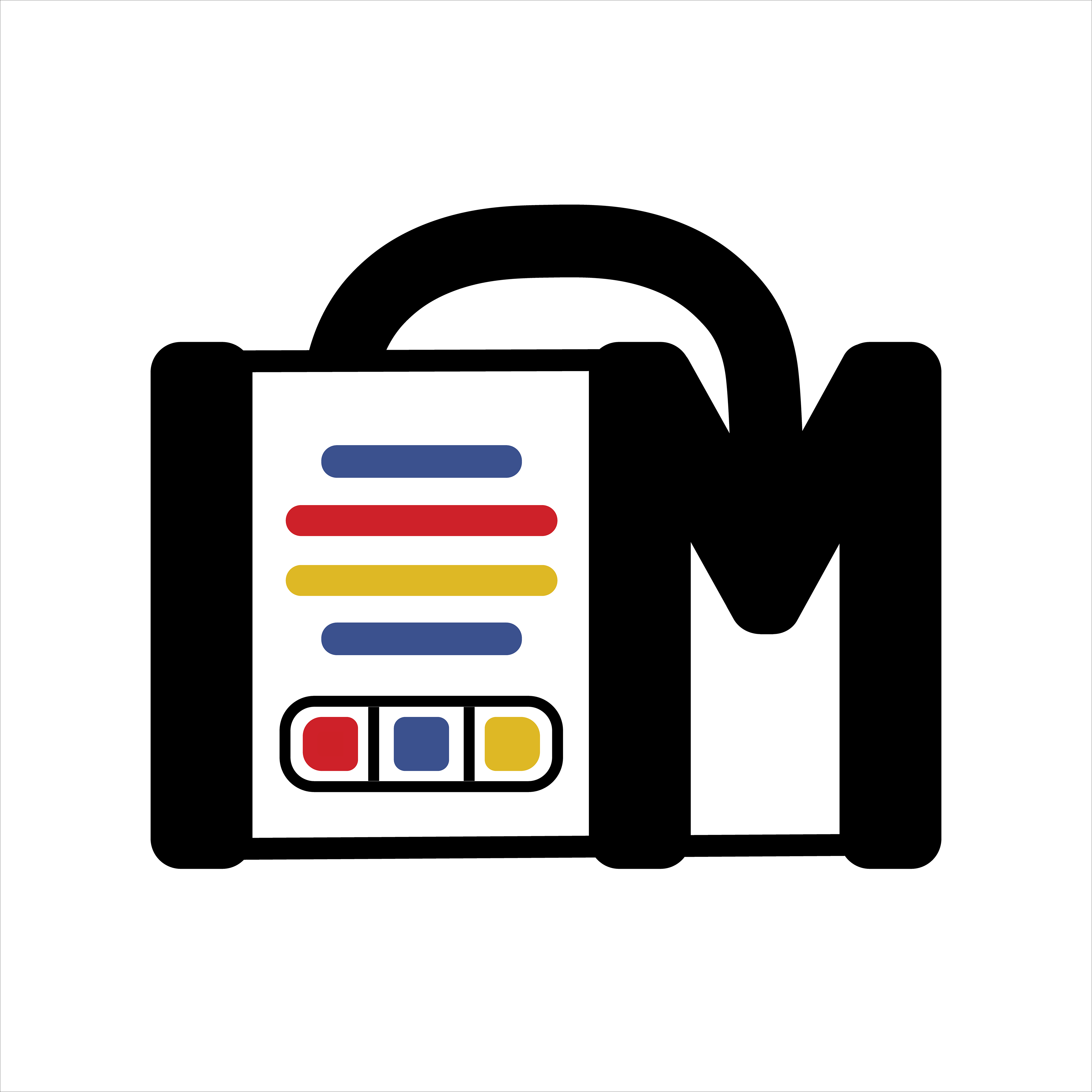
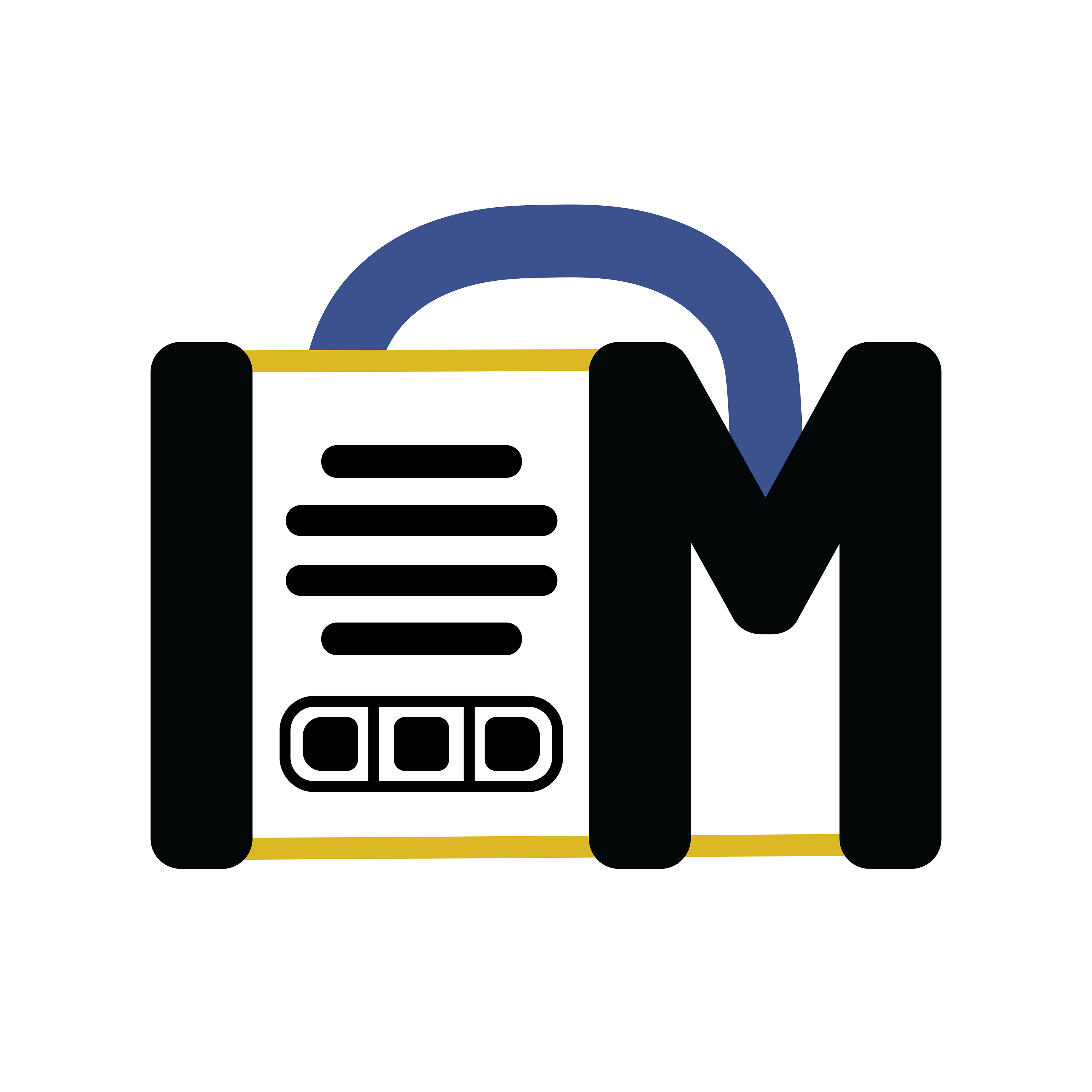
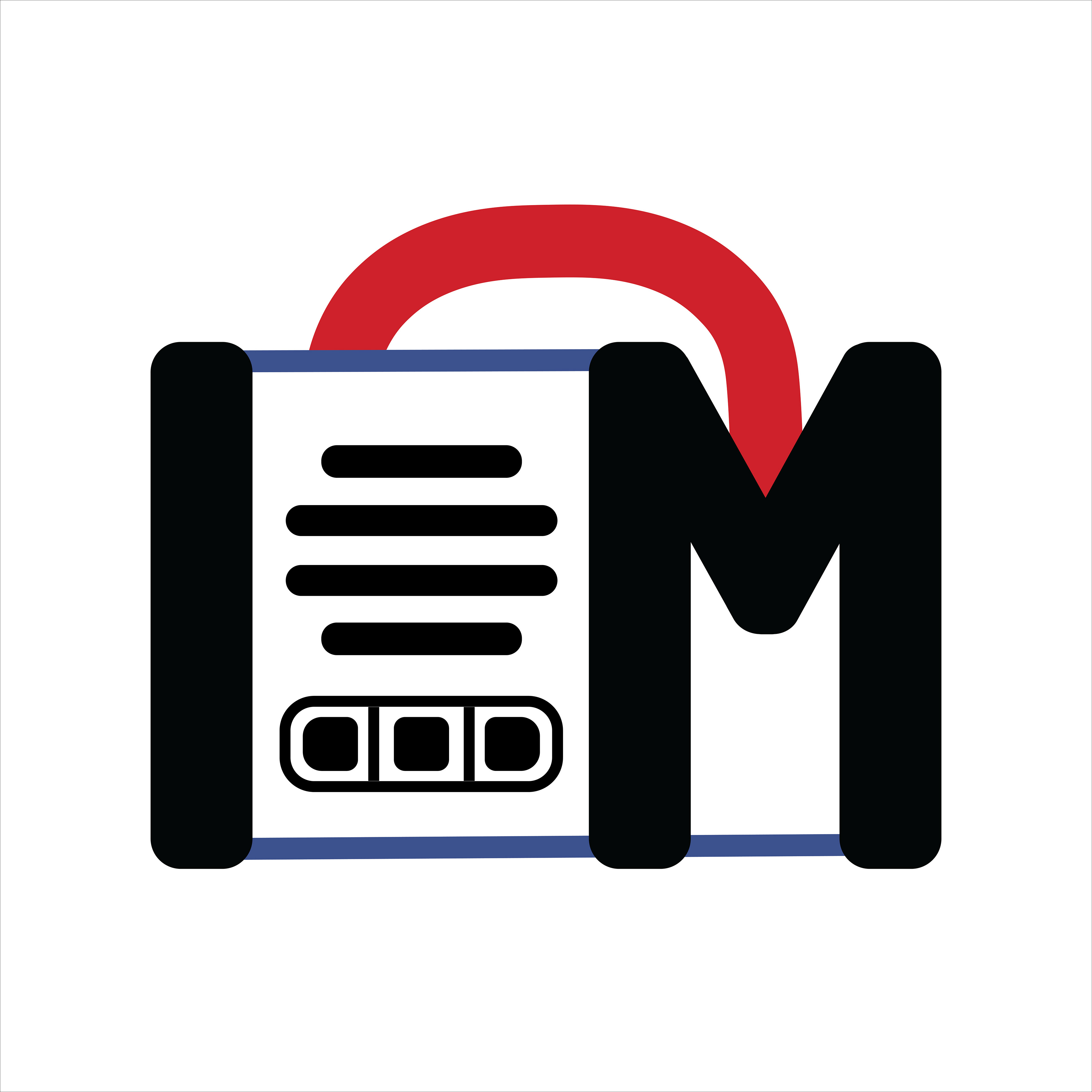
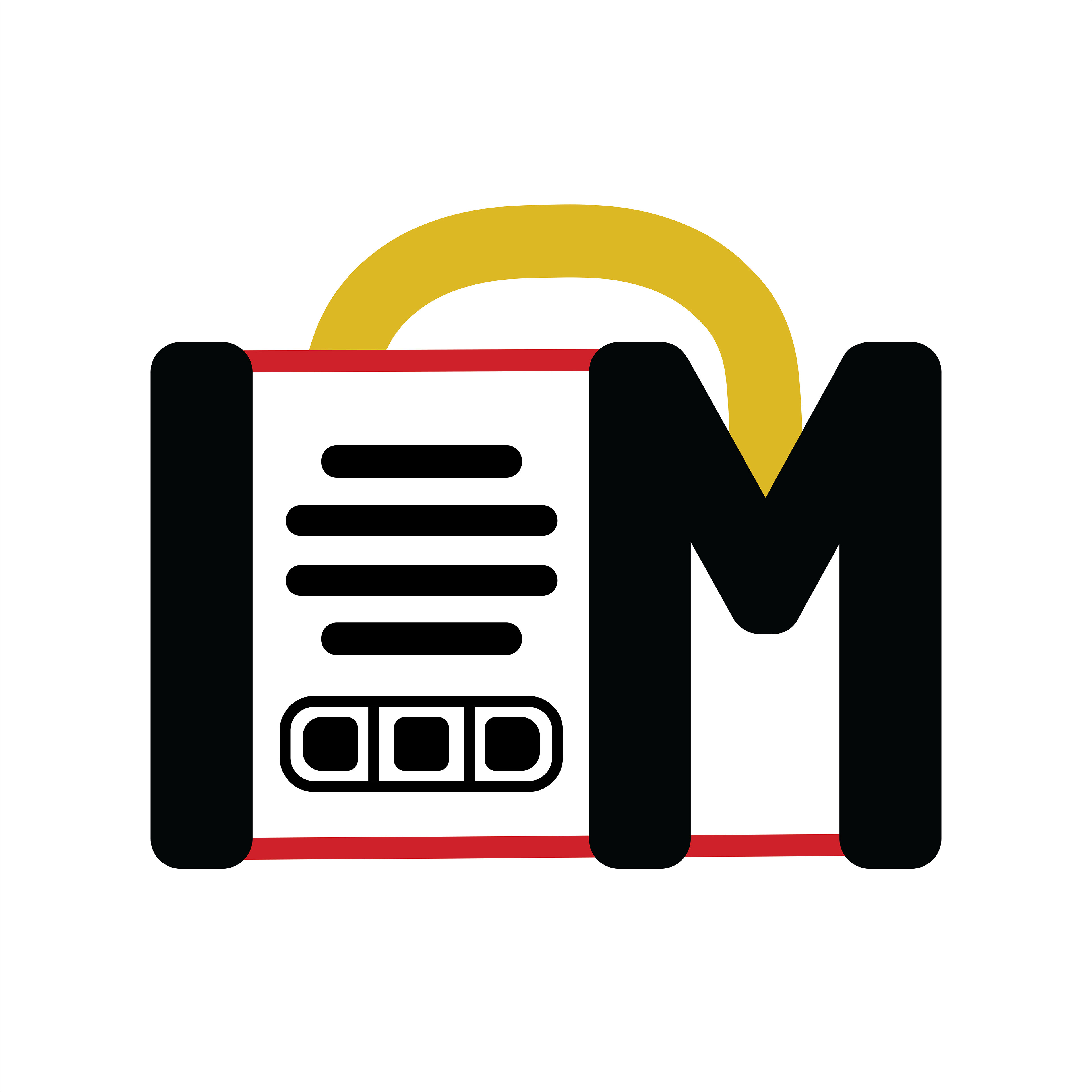
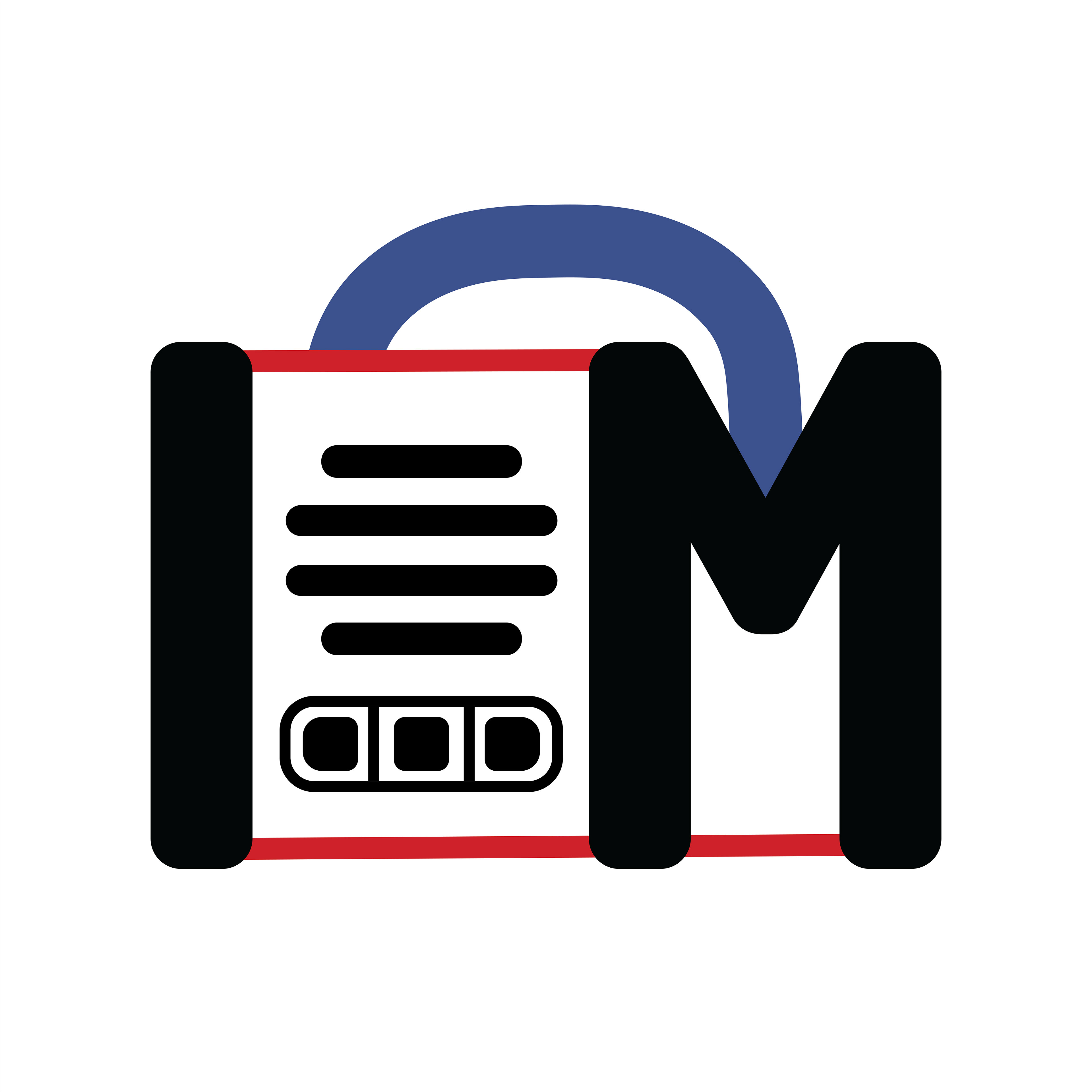
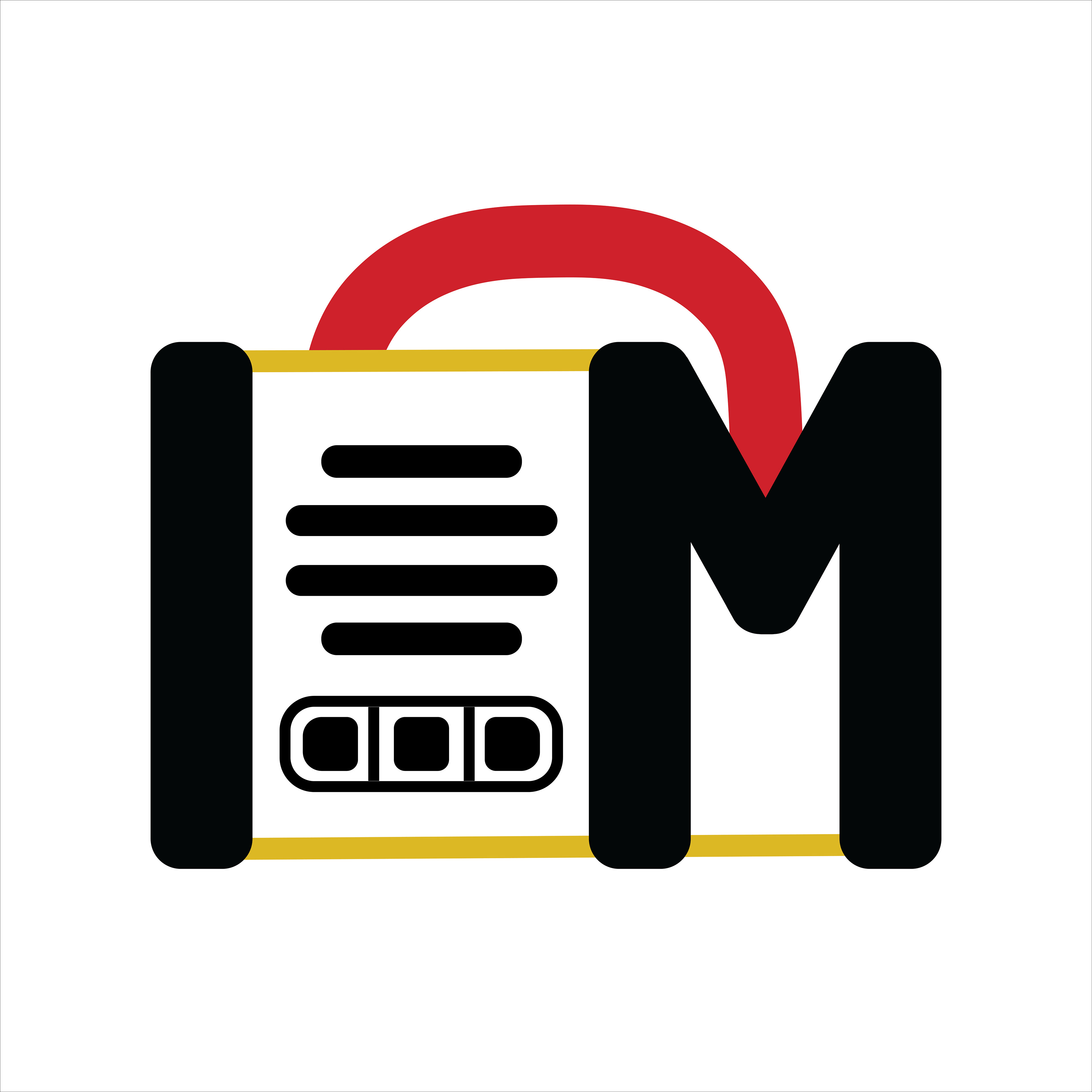
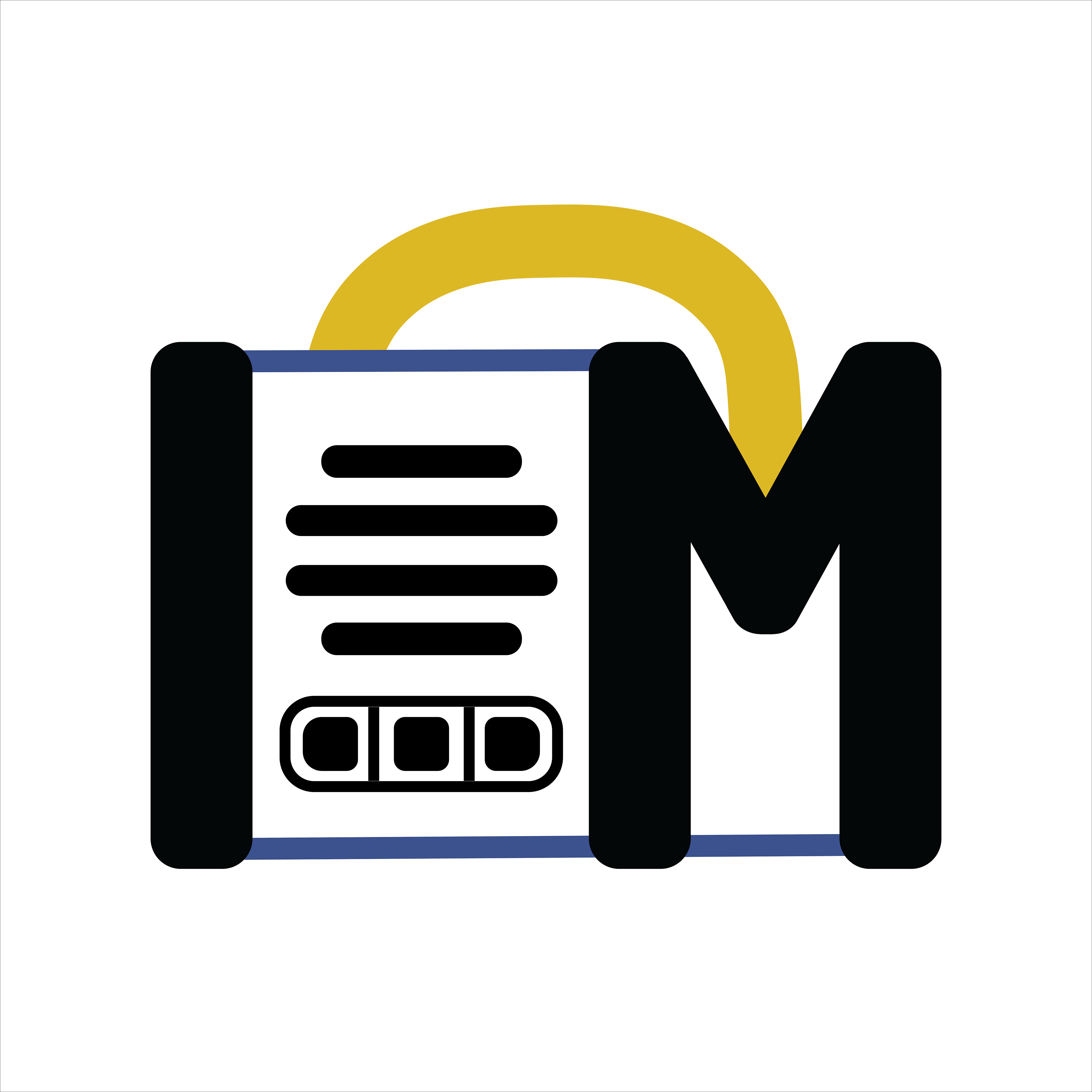
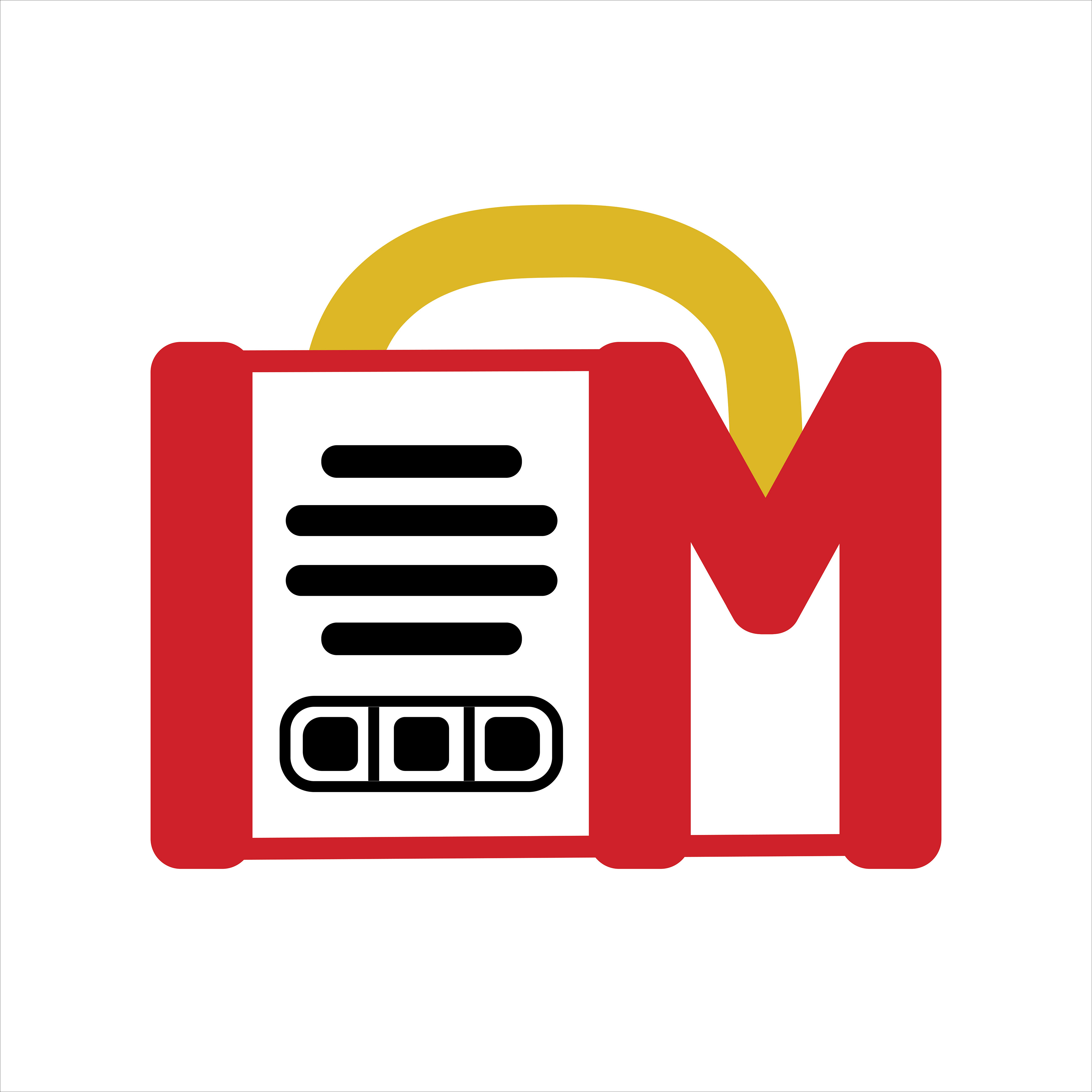
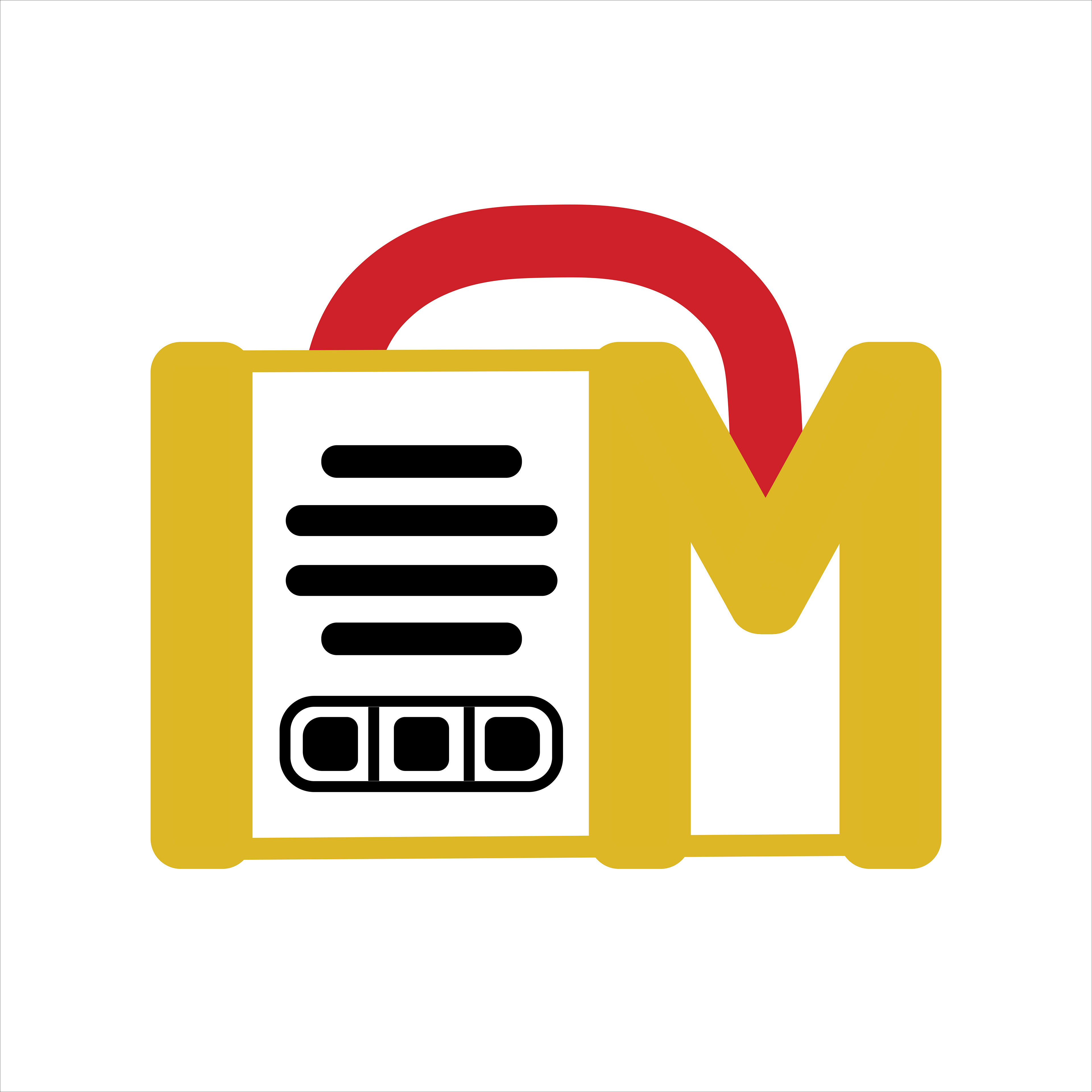
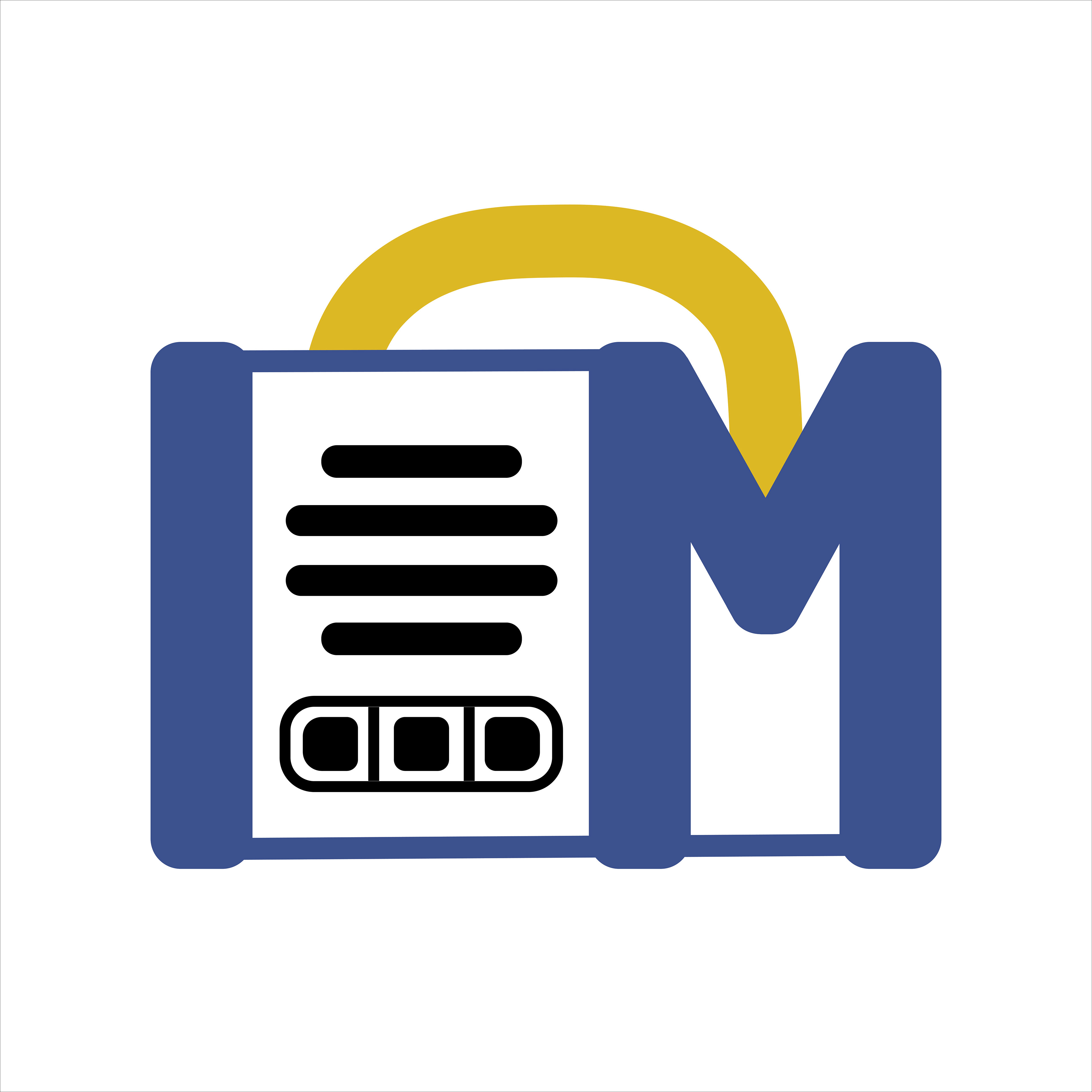
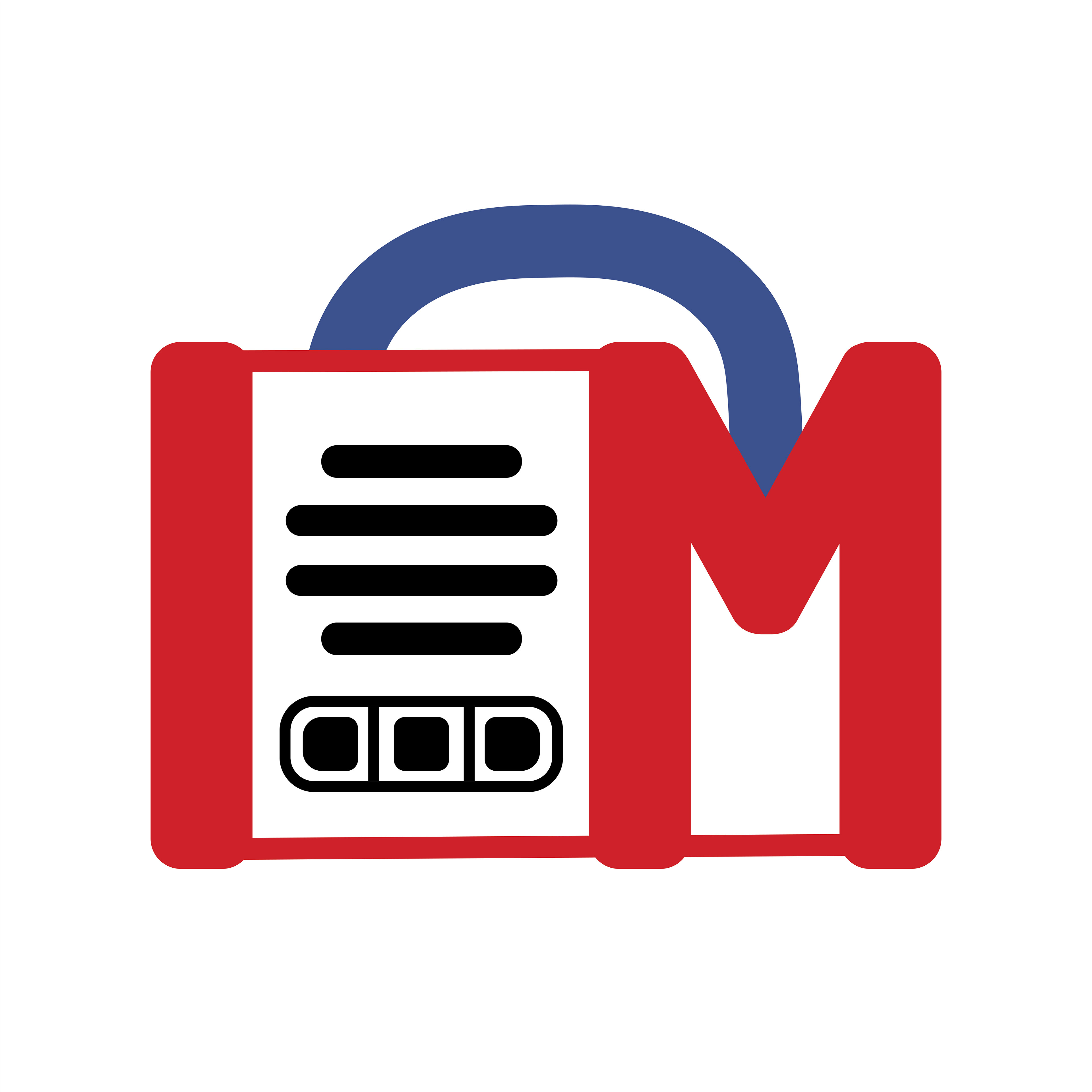
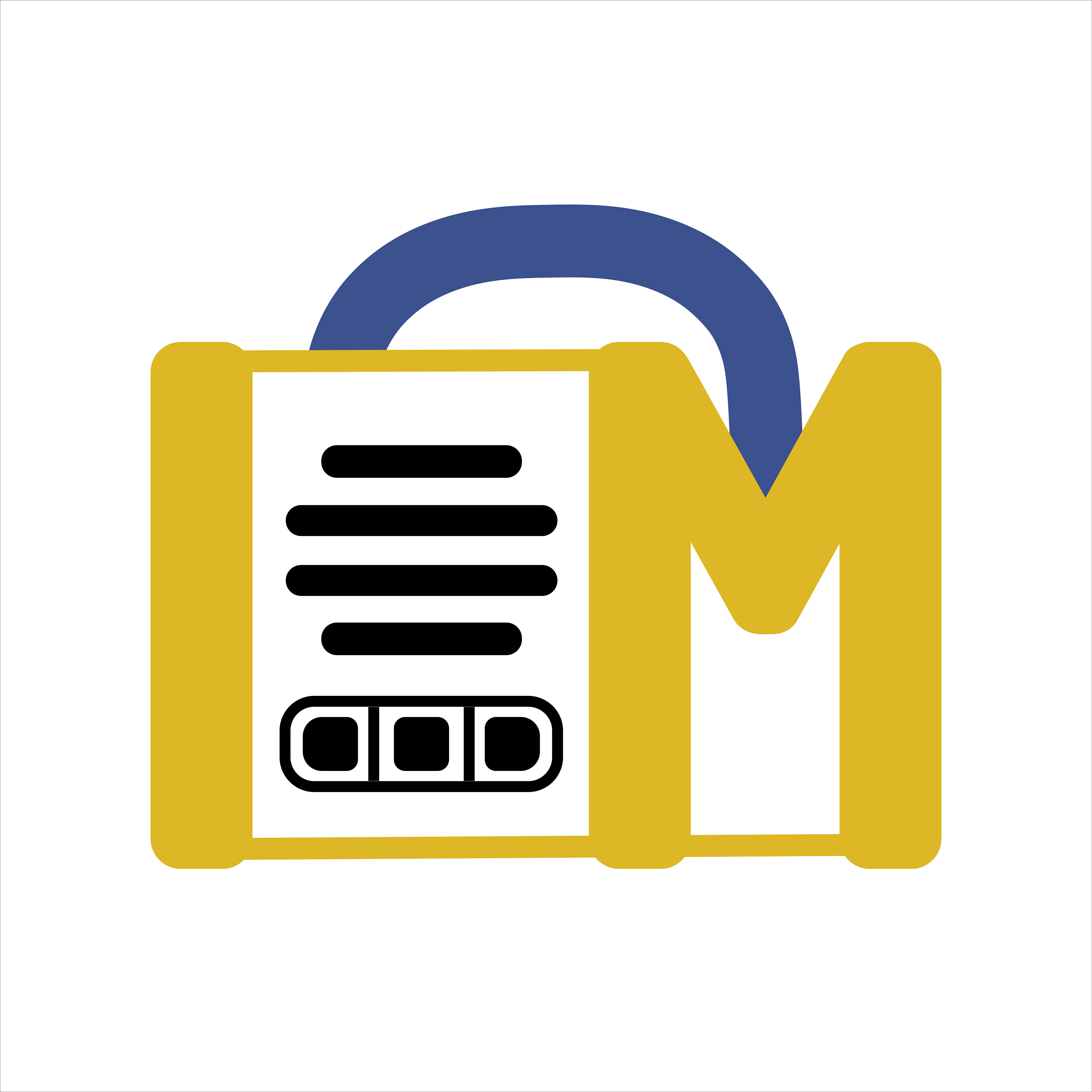
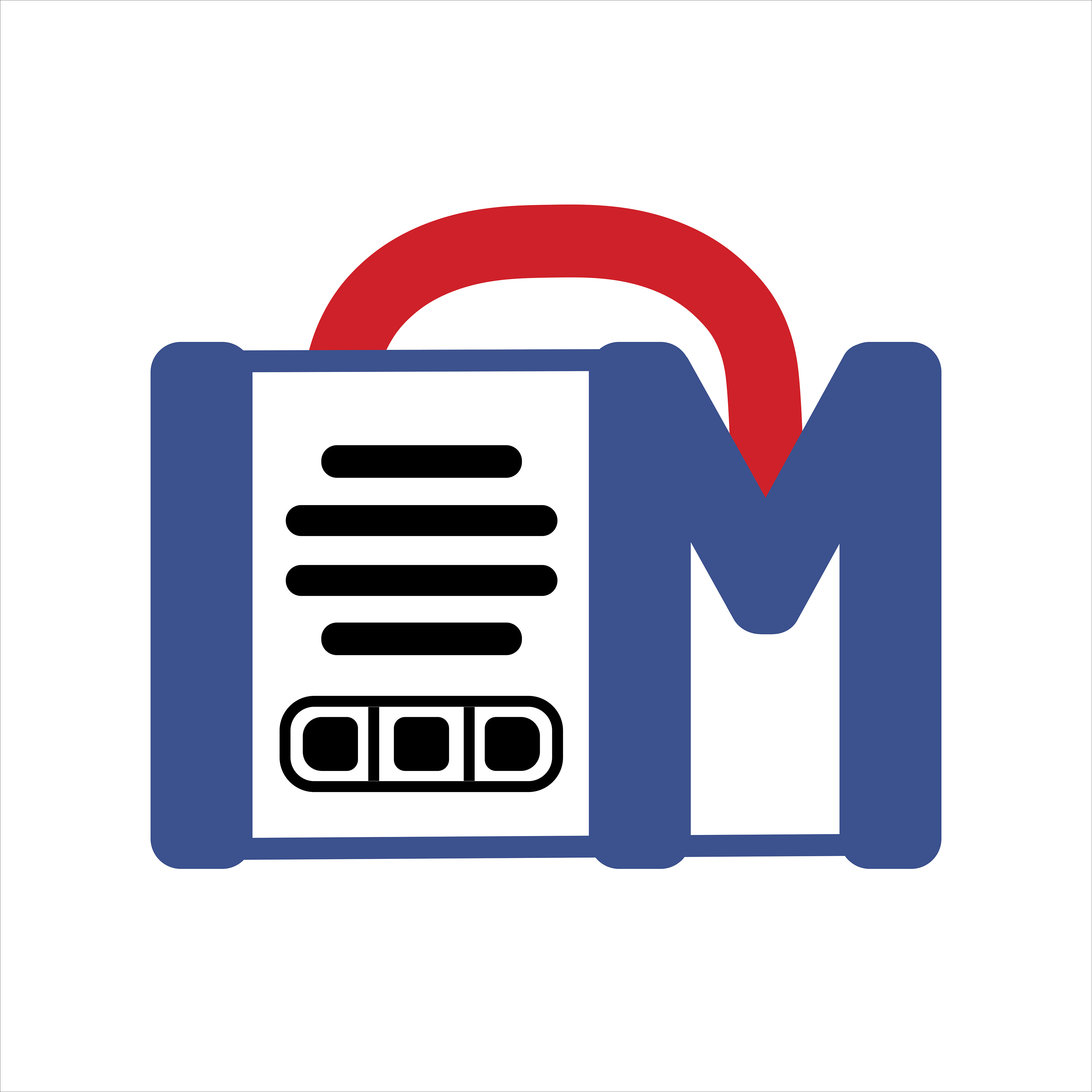
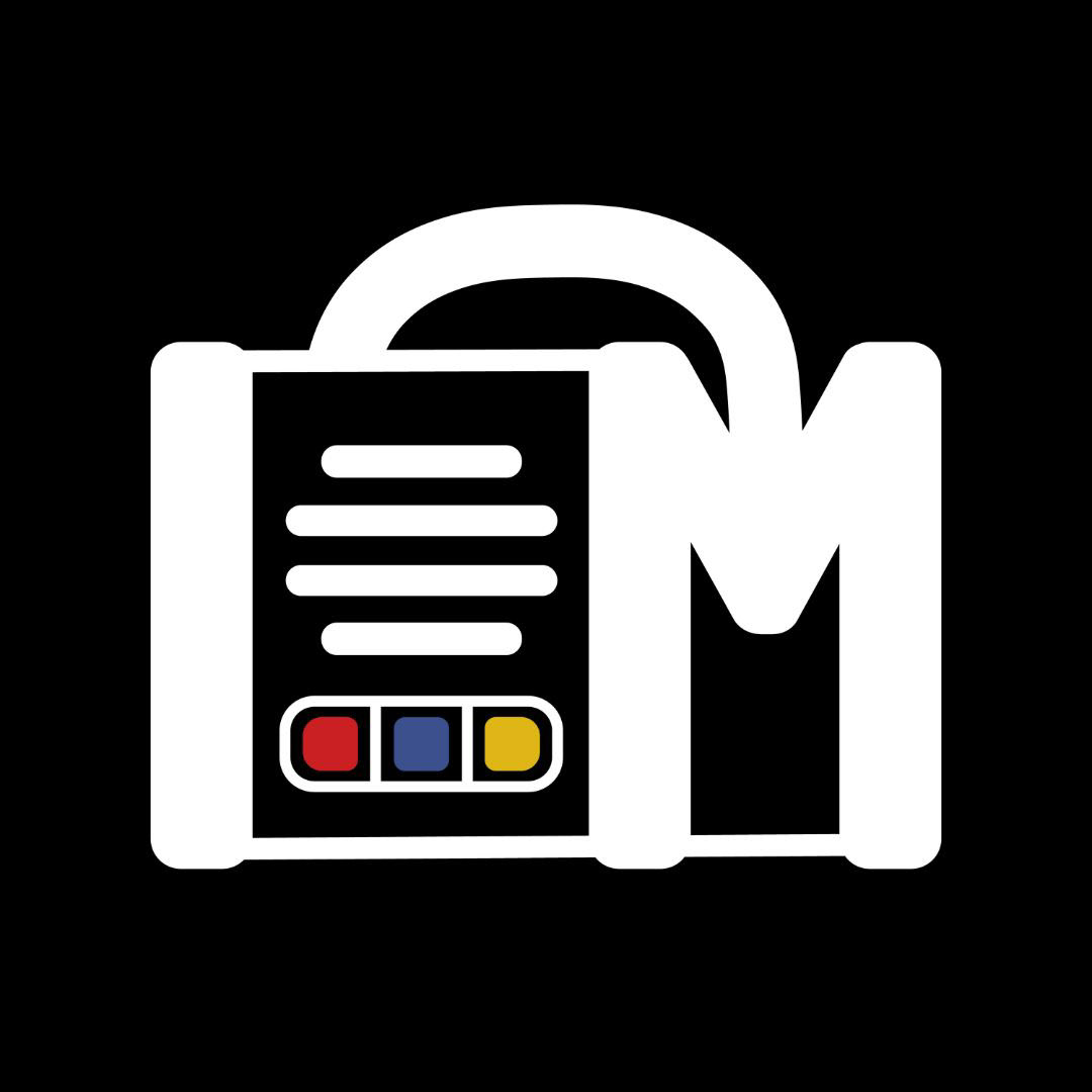
From the options, we decided to go with the black icon with colored buttons for the final icon design.
5 \\ Final Icon Design
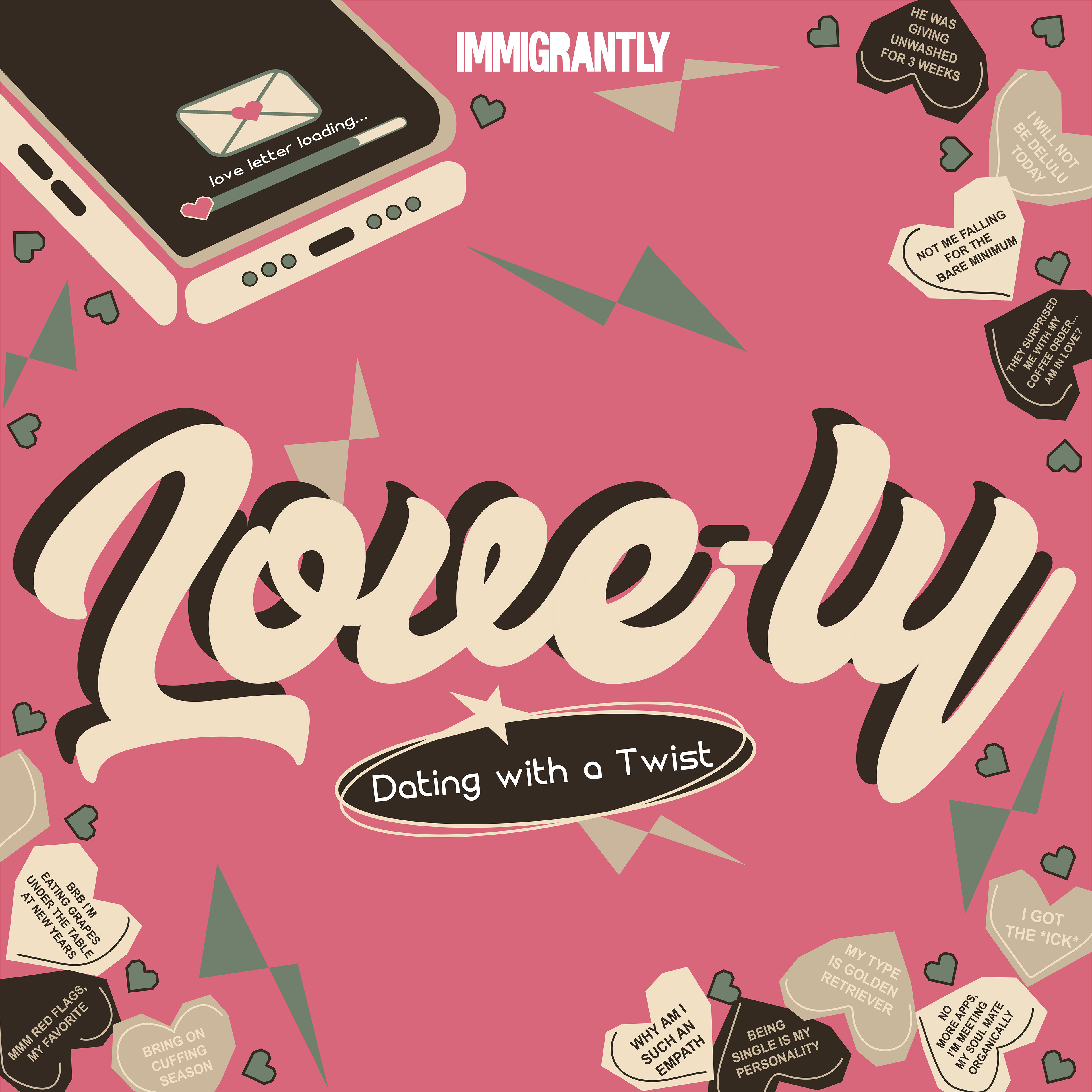
Invisible Hate & Love-ly Podcast Cover Designs