I learned graphic design principles and created a collection of graphic design posters concerning Danish furniture design and Dutch museum design for the first half of my time abroad.
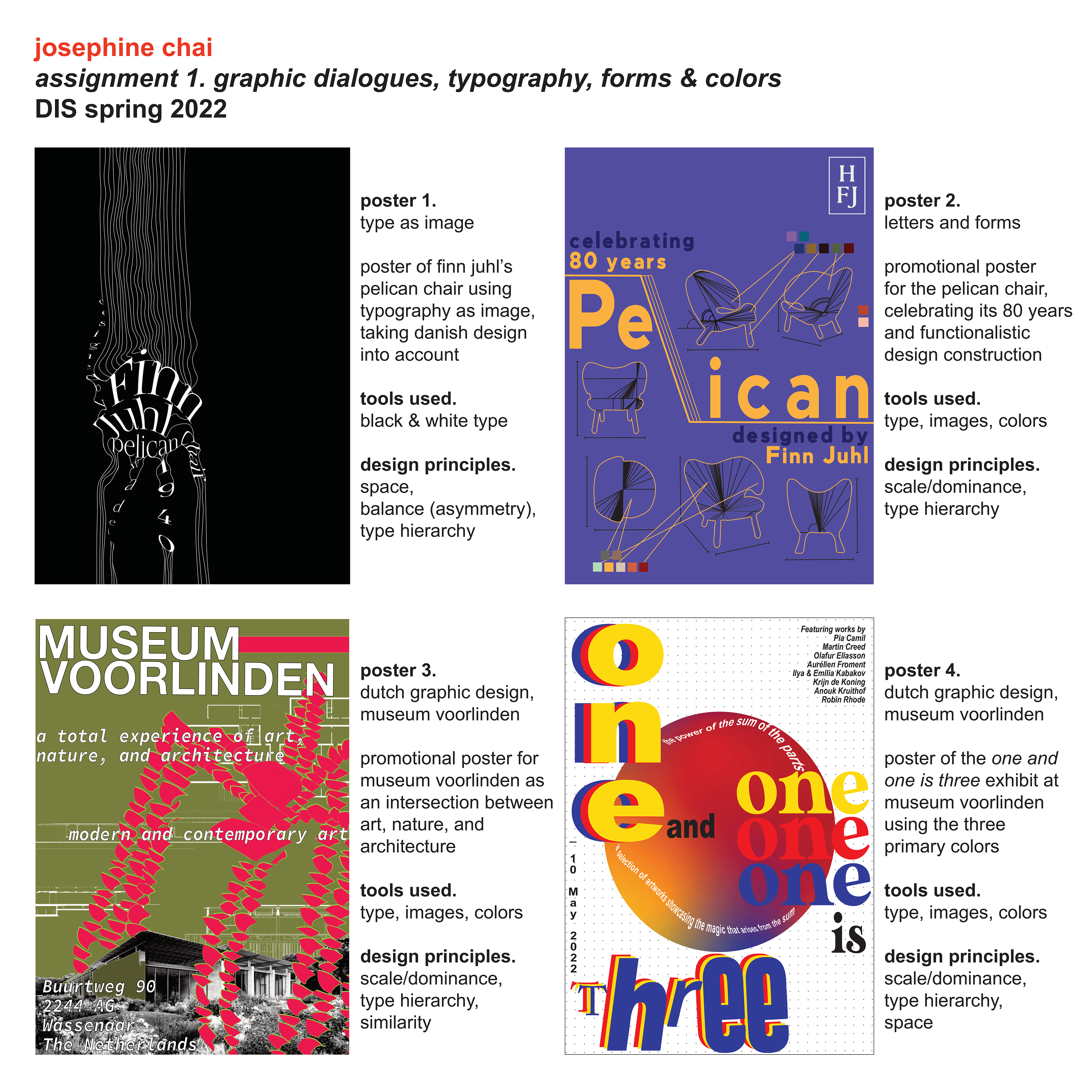
Danish Furniture Design Posters
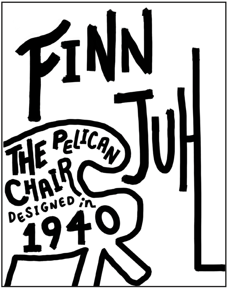
We designed posters showcasing Danish furniture design, namely by renowned Danish architect Finn Juhl and his pelican chair. Our first poster was to be made with only type, while the second poster we were allowed to use type, forms, and colors in our design.
Poster 1: Create a poster showcasing Finn Juhl’s pelican chair using typography while keeping Danish design in mind.
01 \\ Research
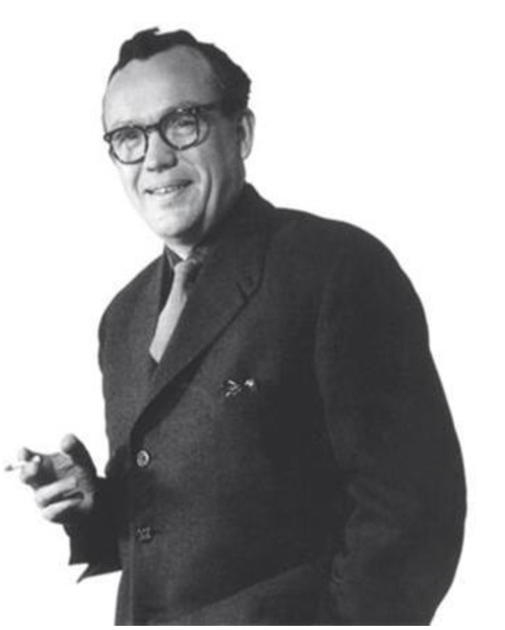
Finn Juhl.
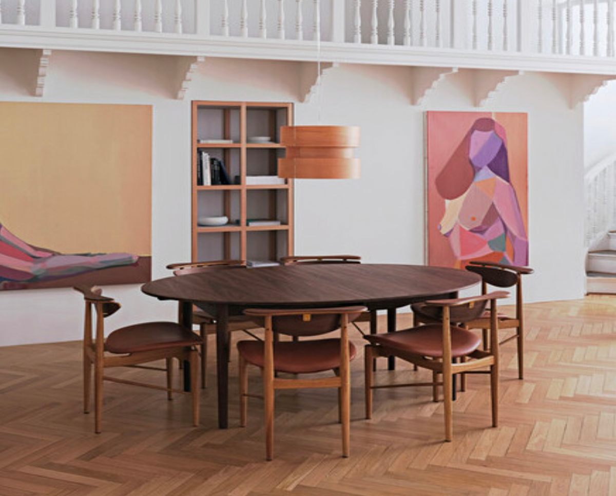
He was a Danish architect, interior and industrial designer, most known for his furniture design. He was one of the leading figures in the creation of Danish design in the 1940s and he was the designer who introduced Danish modern to America. He was known for modernizing furniture; known for his pelican, egg, armstol, and chieftain chairs.
Furniture by Finn Juhl seems to be experimental; he uses darker wood, more extreme shapes, and bold blocks of color. He approached designing furniture in an almost rigidly architectural way, producing neat elevation drawings with rounded soft lines in the wood and organic shapes.
House of Finn Juhl.
In 2001, the House of Finn Juhl was awarded the exclusive rights to produce and relaunch Finn Juhl’s sculptural and iconic design furniture. Today, the unique collection consists of more than 40 classic masterpieces, which are produced with the utmost respect for the original heritage and strict quality requirements.
Danish Design.
Danish design is known for its clean lines sophistication, and functionalistic design.
“Danish modern” is a term that describes the style of minimalist furniture and housewares in Denmark. It became popular through the design contributions of designers, Hans Wegner and Arne Jacobsen. “Danish modern” began to emerge in the 1940s through the 1960s, alongside the Danish design movement.
Key Words: minimalist, clean, sophisticated.
02 \\ Sketching
Sketch 1:
A basic poster design where the type was all bold and coherent to readers. The emphasis was placed on Finn Juhl and the poster was ac- companied with text embedded within the basic shape of the chair.
Sketch 2:
The design was inspired by the minimalist aesthetic of Danish de- sign. I incorporated the used of lines with typography making up the shape of the pelican chair to emphasize Juhl’s use of wood and clean lines in his furniture designs.
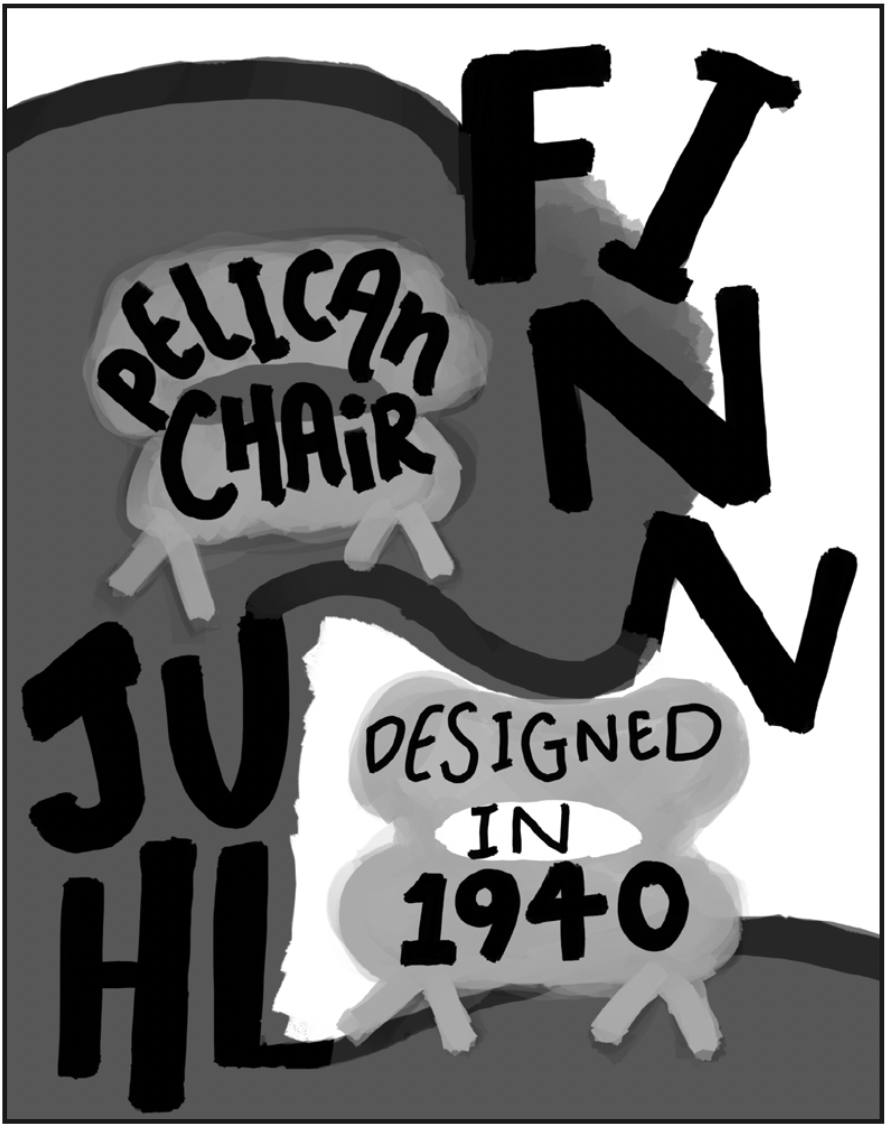
Sketch 3:
I used different shades of black and white with type and the formation of illustration-like components. Finn Juhl would again be the main focus of the poster, as it makes up the large pelican chair in the background, while the accompanying text would make up the smaller chairs in the lighter shades of gray.
03 \\ Developing Ideas
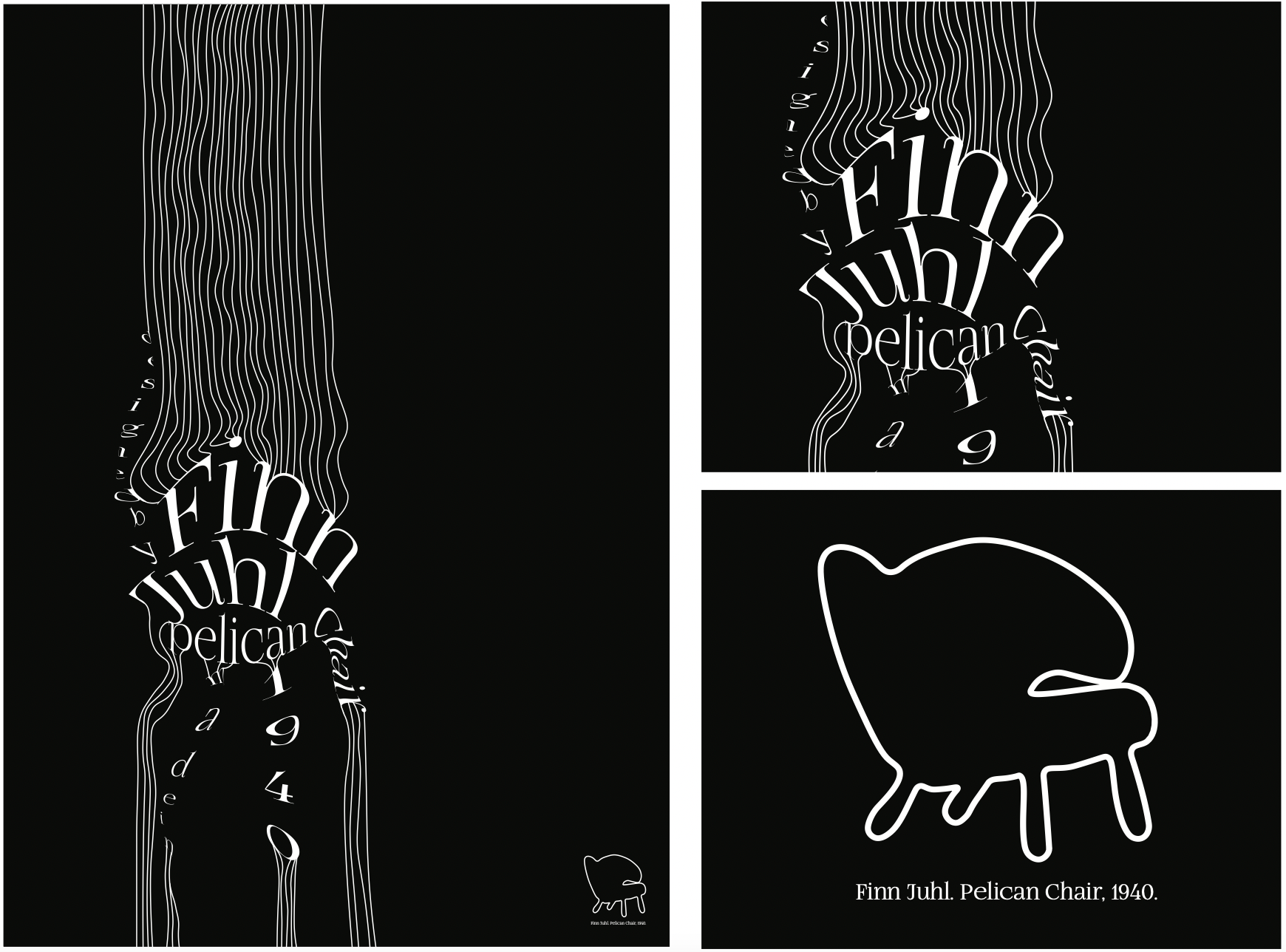
I decided to go with the idea behind sketch 2.
I chose a serif font to go for a more sophisticated feel. I used Adobe Illustrator to morph the typography into the shape of a pelican chair and also drew lines to mimic woodlike texture, as well as connect the chair to the top and bottom parts of the poster.
I added the outline of the pelican chair that i illustrated and placed it in the lower right-hand corner so it is clear that the words are supposed to form the shape of the chair. I placed the words, “Finn Juhl. Pelican Chair, 1940” underneath this chair outline to clearly summarize main premise of the poster.
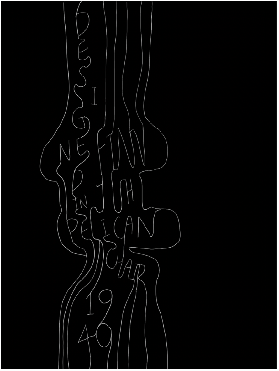
04 \\ Final Design
Design Principles: space, balance (asymmetry), type hierarchy
In the end, I decided to allow the chair convey the shape of the pelican chair only through warped typography, as well as a connecting line that highlights the chair shape and allows it to stand on its own.
We designed posters about an assigned Dutch museum, mine being Museum Voorlinden, and an exhibit at the museum. We continued using type, forms, and colors in our design.
Poster 2: Create a promotional poster for The House of Finn Juhl celebrating 80 years with the Pelican chair. The poster should include type and images/illustrations in color. Try to visually tell a story through the poster.
01 \\ Research
Pelican Chair.
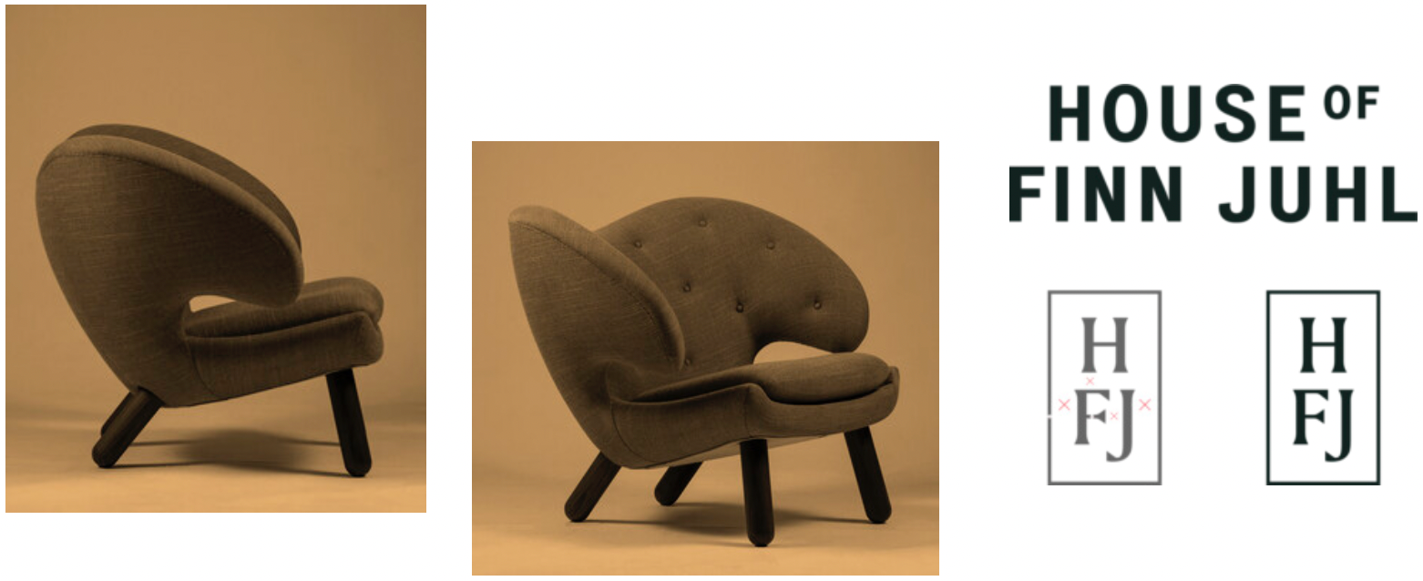
Out of all of Juhl’s many designs, the Pelican Chair was probably the one furthest ahead of its time. When it was presented at the Copenhagen Cabinetmakers’ Guild Exhibition in 1940, it stood out with its unusual shape and sturdy legs.
The chair’s soft and organic shape is almost like a body holding a body; when you sit down, the chair gives you a friendly hug. Like many of Finn Juhl’s later designs, the chair offers several comfortable ways to sit.
Juhl's Approach to the Pelican.
Rather than addressing the design of a furniture from an functional angle, in the classical manner, Finn Juhl approached his work in the manner of a sculptor, seeking the beauty of the volume and shape, life and expressiveness, an approach that, in the 1940s and 1950s, was then completely new. For Finn Juhl, it was clear that furniture could not be limited to function, but should also express an artistic sensibility.
Color Palette.

Finn Juhl experimented with an assortment of strong colors in his furniture designs. These colors allowed his furniture to stand out and invoke distinct emotions from customers.
His palette is distinct with dark, dull sage greens, a fair bit of dark turquoise and deep ochres and deep maroons.
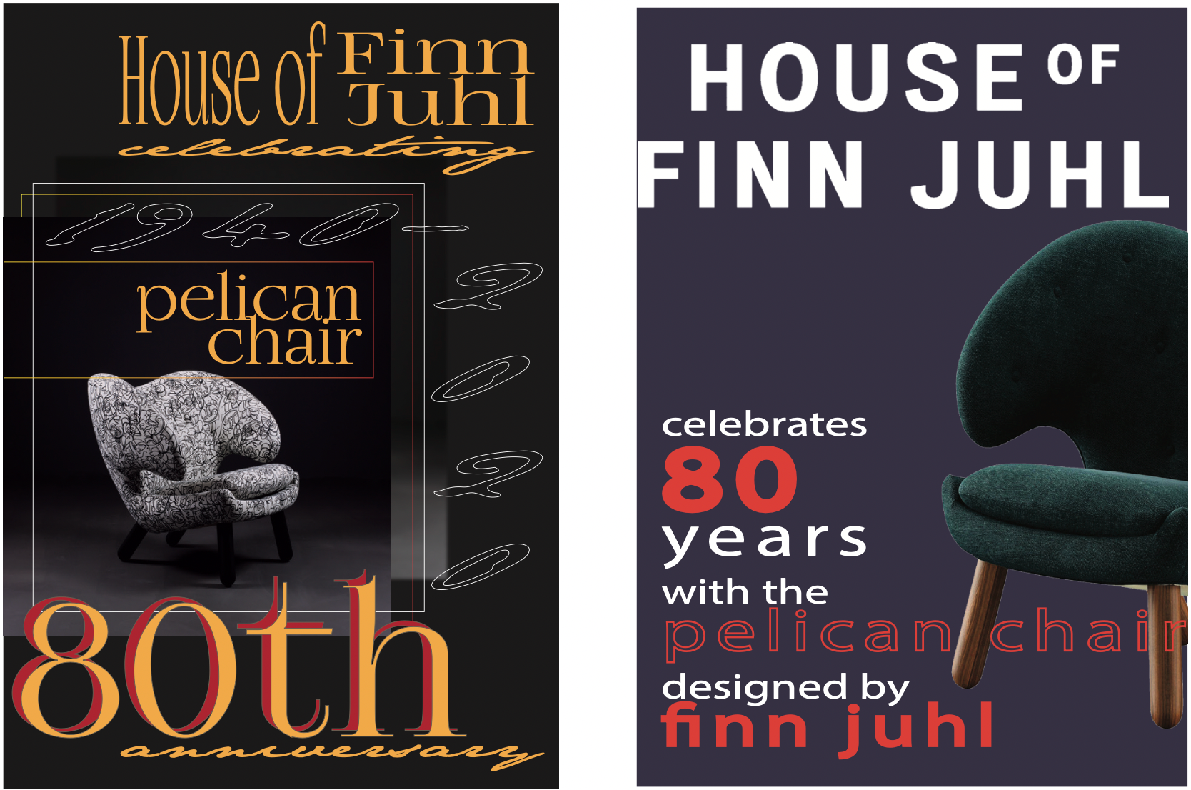
02 \\ Sketching
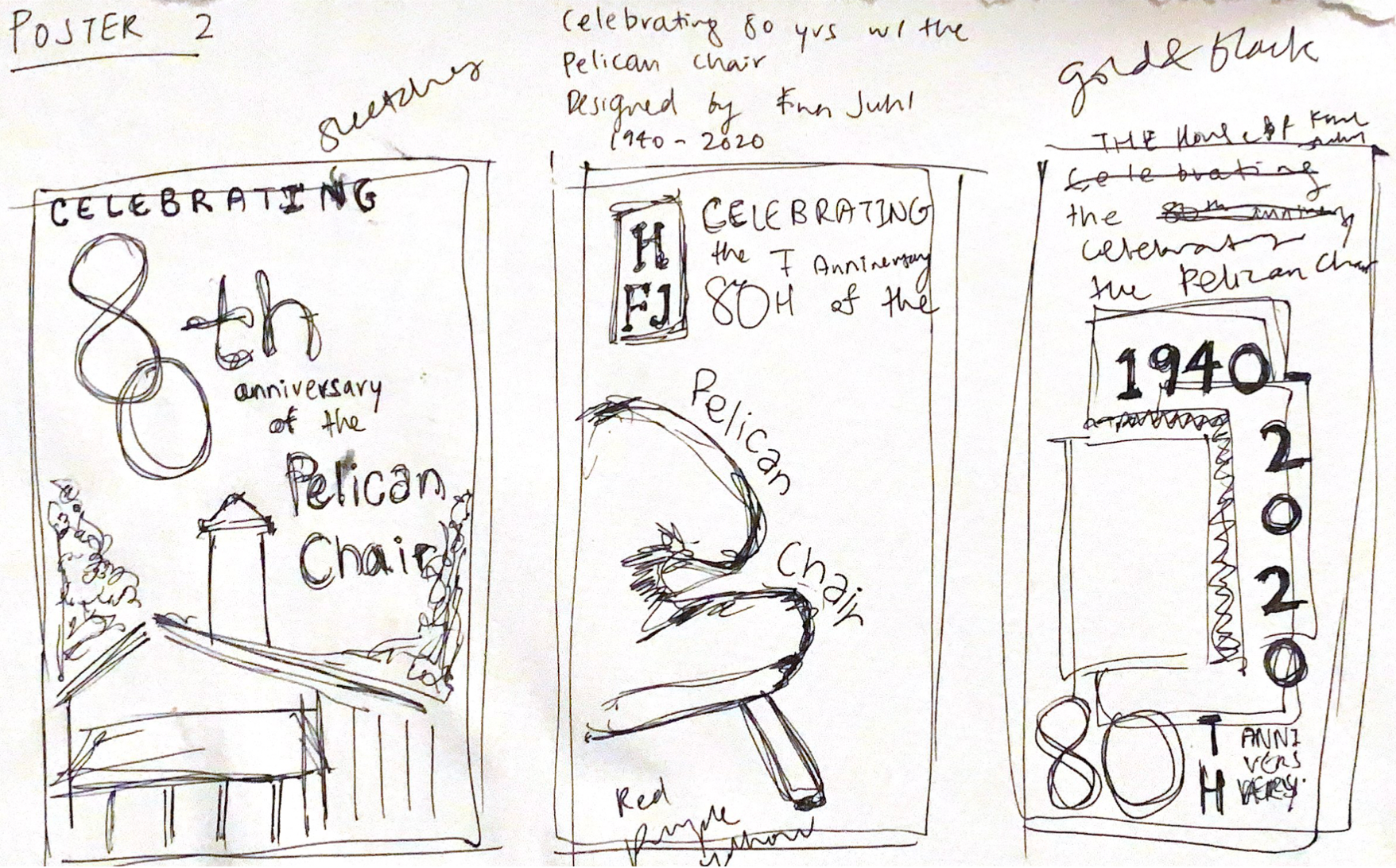
Sketch 1: I envisioned a poster where the “80th” anniversary of the chair is emphasized through enlarged type. I also wanted an illustration/architectural blueprint and timeline of The House of Finn Juhl to place emphasis on the company’s success of the Pelican Chair and its design.
Sketch 2: The second design uses the strategy of only showing part of the chair, instead of the whole chair and using type to fall along the curves of the chair to emphasize the Pelican Chair and its accomplishment.
Sketch 3: The last design I wanted to try the method of using repeating images overlayed on top of each other, as well as playing with color blocking. The main focus of the poster would again be on the “80th” anniversary part, and the years the Pelican Chair have spanned thus far.
03 \\ Developing Ideas
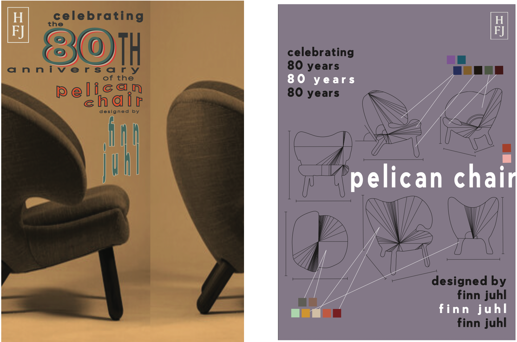
04 \\ Final Design

Design Principles. Scale/Dominance, Type Hierarchy
I decided on a design that incoporates sketches of the chair to create a sense of the chair’s development through time with lines and angles. I used bold colors of blues and yellow as the poster’s primary colors and kept swatches of colors Juhl tended to use in his designs and kept the font simple with sans.
Dutch Museum, Exhibit Posters
Poster 3: Create a promotional poster about your assigned site, Museum Voorlinden, using a modular grid, type, colors, and images/illustrations.
01 \\ Research
Museum Voorlinden’s Mission.
Museum Voorlinden presents modern and contemporary art and connects people, art, nature and architecture. The museum envisages to be a meeting place where people like to sojourn. Voorlinden wants to be an oasis of tranquility in the hectic city where people can go marvel and be surprised. The total experience of art, nature and architecture is key in the way of presenting and approaching visitors.
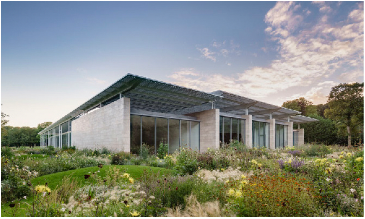
Architectural Design.
The museum has a very distinct architectural design. It consists of dune sand-coloured natural stones and transparent glass walls, which enhances the experience of nature inside the building. An elegant, white-steel colonnade makes up the roof structure.
The exhibition rooms are illuminated by the natural daylight that brings the artwork to life. Its architecture allows for light to fall into the building in through cut tubes and their transparent glass roof, ensuring that the artwork is illuminated as naturally as possible on less sunny days and in the evenings at all times.
Visual Identity and Branding.
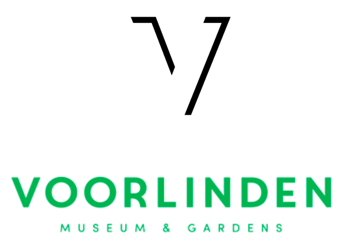
The visual identity encompasses art and landscape coming together. The logo focuses on using the “V” in Voorlinden and playing with the concept of showing the light from the museum’s exhibitions and architecture.
The shadow effect on the “V” represents the idea of light also fitted in perfectly with the experience in the museum. In turn, extreme attention was paid to the incidence of light and where inside and outside were involved as much as possible.
The visual identity encompasses art and landscape coming together. The logo focuses on using the “V” in Voorlinden and playing with the concept of showing the light from the museum’s exhibitions and architecture.
02 \\ Sketching

Sketch 1:
I thought about doing a color blocking poster for the museum using their prominent colors to highlight their play on light and shadows, while featuring the museum and its architectural towards bottom center.
Sketch 2:
Another idea was to use architectural blueprints of the museum to overlay
on the top part of the poster, above another architectural display of the museum at bottom center.
on the top part of the poster, above another architectural display of the museum at bottom center.

03 \\ Developing Ideas
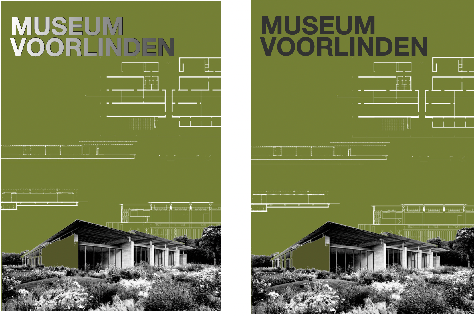
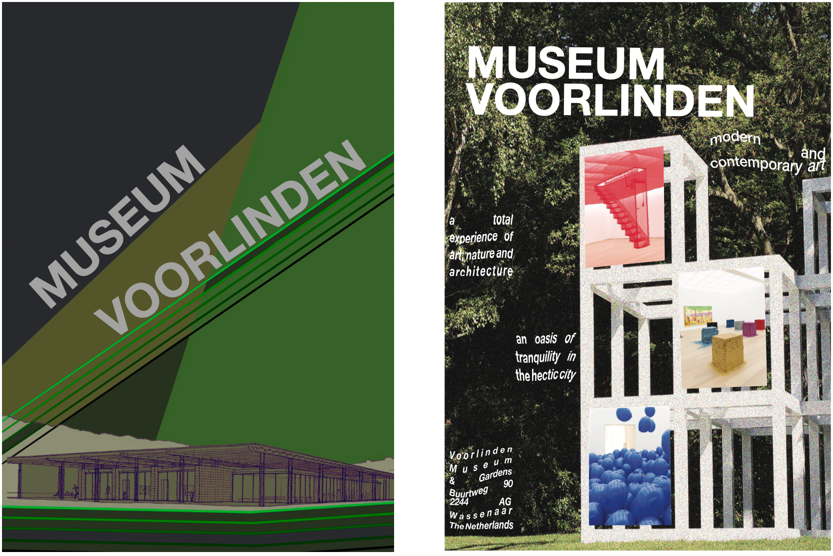
04 \\ Final Design
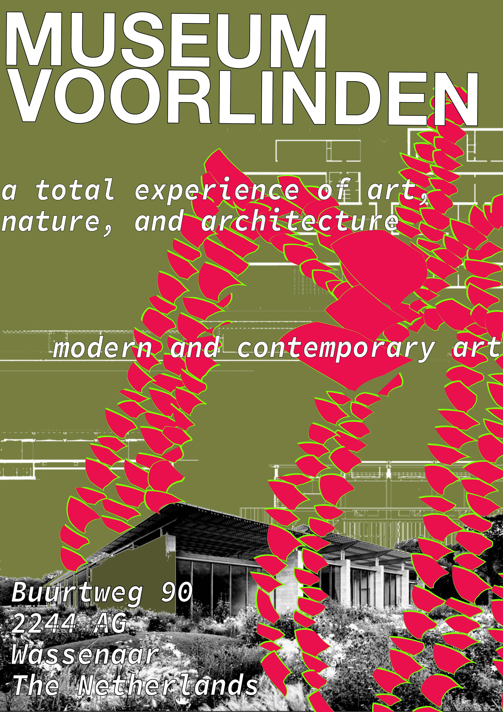
Design Principles. Scale/Dominance, Type Hierarchy, Similarity
After receiving feedback, I incorporated the museum’s art into the poster
by featuring its outdoor spider sculpture, using a bold pink and green. I
also added useful accompanying information in a new typeface and played with scale.
by featuring its outdoor spider sculpture, using a bold pink and green. I
also added useful accompanying information in a new typeface and played with scale.
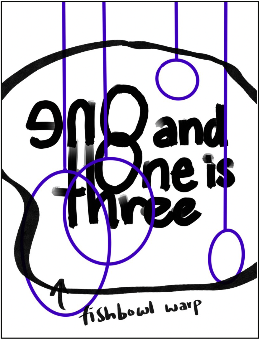
Poster 4: Create a Dutch-like promotional poster about an exhibit within your assigned site, Museum Voorlinden, using type and colors.
01 \\ Research
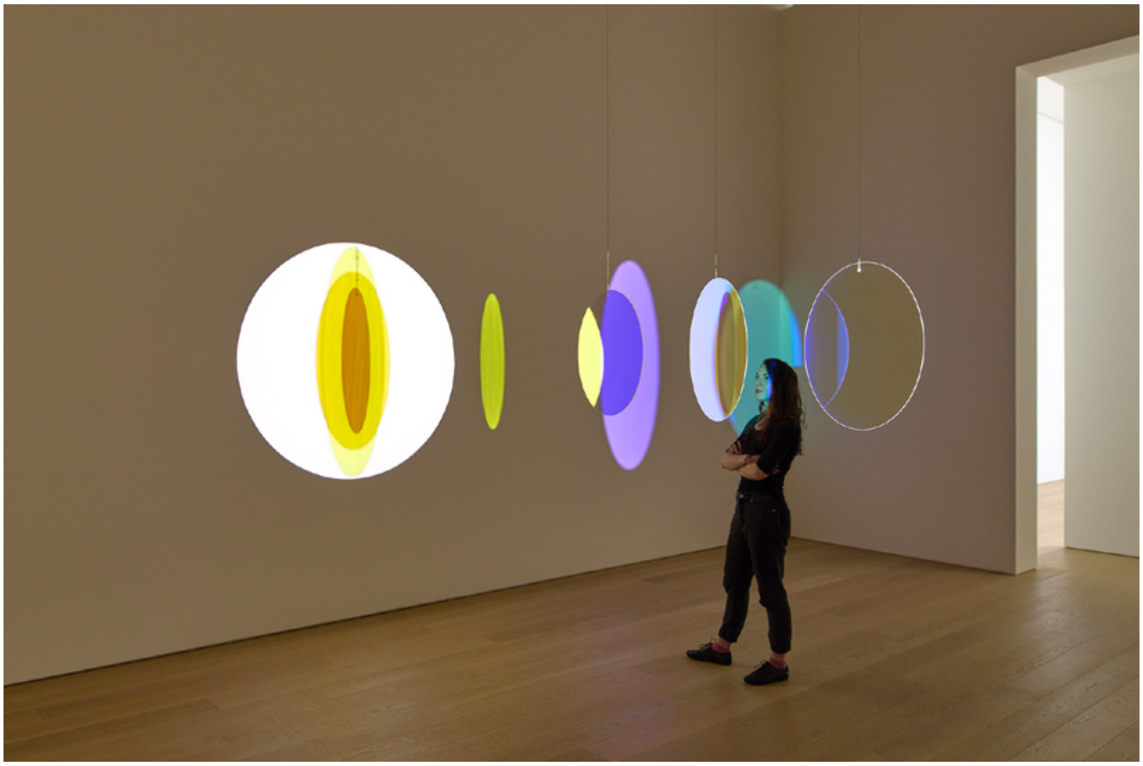
Eén en Eén is Drie (One and One is Three) is about the power of the sum of the parts. The selection of artworks from the Voorlinden collection shows the magic that arises from the sum. In this exhibition, works by Pia Camil, Martin Creed, Olafur Eliasson, Aurélien Froment, Ilya & Emilia Kabakov, Krijn de Koning, Anouk Kruithof and Robin Rhode are on display. This exhibition runs until 10 May 2022.
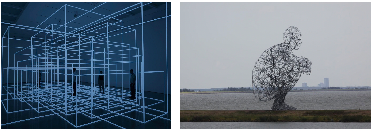
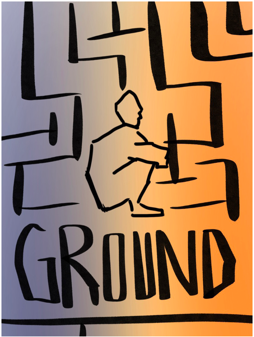
In the summer of 2022, Antony Gormley (1950) will take over the Voorlinden Museum. He is renowned worldwide for his sculptures, installations and public works that explore the relationship between the human body and the space around us. The major retrospective exhibition GROUND brings together work spanning Gormley’s career, from his early lead sculptures from the 1980s to recent large-scale installations. He is well known for his works in the public realm, including his crouching body form Exposure near Lelystad in the Netherlands.
‘I have called this exhibition GROUND to make this open invitation of sculpture clear. Without the viewer there is no show, without the gallery there is no context. The joy of this kind of exhibition is to allow the richness of the context itself to become activated by sculpture. For me, the body of the viewer is often the activating principle in a ‘ground’ of contemplation: the works become catalysts for awareness and grounds for physical and imaginative inhabitation.”
02 \\ Sketching
Sketch 1:
I thought about a design where the “one and one is three” is arranged in a way where the typography makes up the image’s central focus. I was also inspired by the site’s setup to play with shapes, colors, and light.
Sketch 2:
I initially envisioned a poster with the crouching man as the central focus.
Additionally, I was inspired by the cubic display to include a potential maze, along with a rigid font that says “GROUND.”
03 \\ Developing Ideas

04 \\ Final Design

Design Principles. Scale/Dominance, Type Hierarchy, Space
I attempted to use only type and colors in the poster to resemble Dutch design. I decided to use the classic three primary colors as the color palette and decided to play with command of color and three consistent typefaces.